Developer User Guide
Developer users can do the following in Config Tool 2.0:
| Component | View | Set Up | Maintain |
|---|---|---|---|
| Interactives | ✓ | ✓ | ✓ |
| Theme Schemas | ✓ | ✓ | ✓ |
| Themes | ✓ | ✓ | ✓ |
| Micro Apps | ✓ | ✓ | ✓ |
| Tables | ✓ | ✓ | ✓ |
| Aircraft Configurations | ✓ | ✓ | ✓ |
| Content Loadable Packages | ✓ | ✓ | ✓ |
| Jobs | ✓ | ✓ | ✓ |
| Uploads | ✓ | ✓ | ✓ |
| Downloads | ✓ |
For other standard tool functionalities, refer to Standard Functionalities.
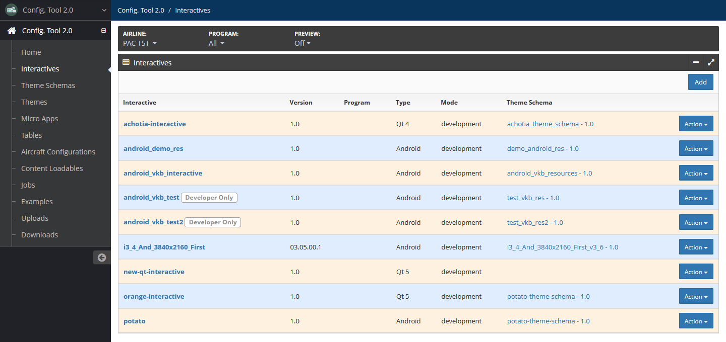
Interactives
An interactive represents an application, such as the interactive or virtual keyboard.
For more information on interactives, refer to Interactives. Only developers can set up and maintain interactives.
Access interactives by selecting Interactives in the left navigation menu.
Prerequisites
You will need the following before creating an interactive:
List of LRU types and subtypes by passenger class for each LRU the interactive supports.
The interactive theme schema.
Copies of micro apps, if any.
Theme names.
Starting interactive version number.
Add an Interactive
To add an interactive:
On the Interactives page, select Add.
On the Add Interactive page, add the following details:
Name — Required
Unique interactive name using only alphanumeric characters, underscores and hyphens.
Description — Optional
Description about the interactive.
Version — Required
Interactive version number.
Type — Optional
Select your GUI application development platform from the dropdown list.
If you select Android, you can enter the following optional android configuration details:
Android APK Package Name
Android APK Version
OBB Package Type
Theme Schema — Optional
Select the interactive theme schema from the dropdown list. This can be added later.
Programs — Optional
Select the applicable programs, if any.
Developer Only — Optional
Select this checkbox if the interactive is for development purposes only. If selected, the interactive and its themes, micro apps and tables are not available to airline users.
Legacy Qt Config Tool — Optional
Select this checkbox if you are using the legacy Qt tool.
Content Loadable Targets — Optional
Select the + icon to add a content loadable target. Enter values for the Class, LRU type and LRU Subtype fields. Continue adding targets until all targets are added.
To remove a target, select the x icon next to the target to the deleted.
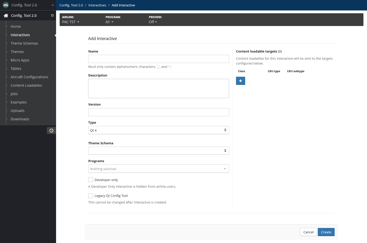
Select Create.
Edit Interactive
To edit an interactive:
On the Interactives page, locate the interactive to update.
Select Action, then select Edit from the dropdown menu, or select the interactive, then select Edit.
The following fields can be updated:
Name — Required
Unique interactive name using only alphanumeric characters, underscores and hyphens.
Description — Optional
Description about the interactive.
Version — Required
Interactive version number.
Type — Optional
Select your GUI application development platform from the dropdown list.
Mode — Required
Select either Development or Production.
Theme Schema — Optional
Select the interactive theme schema from the dropdown list. This can be added later.
Programs — Optional
Select the applicable programs, if any.
Developer Only — Optional
Select this checkbox if the interactive is for development purposes only. If selected, the interactive and its themes, micro apps and tables are not available to airline users.
Legacy Qt Config Tool — Optional
Select this checkbox if you are using the legacy Qt tool.
Content Loadable Targets — Optional
Edit content loadable targets as needed.
To add a new target, select the + icon to add a content loadable target. Enter values for the Class, LRU type and LRU Subtype fields. Continue adding targets until all targets are added.
To remove a target, select the x icon next to the target to the deleted.
Select Update.
Delete an Interactive
To delete an interactive:
On the Interactives page, locate the interactive to be deleted.
Select Action, then select Delete.
Confirm the deletion by selecting Delete.
Create an Interactive Version
An interactive version is a copy of an interactive and associated theme schema, themes and micro apps.
Handle interactive versions as you would a software release. Create a new interactive version only when there are substantive changes to the theme schema or other components that are not compatible with the previous version.
Once created, the new version becomes the primary version—interactive versions in Config Tool 2.0 are not intended to be backward compatible.
To create a new interactive version:
On the Interactives page, locate the interactive to create a version.
Select Action, then select Create Version.
Fields are prefilled with details from the interactive of which you are creating a version. Modify the details as needed. The Name, Type, Developer Only and Programs fields are not modifiable.
Description — Optional
Description about the new interactive version.
Version — Required
New interactive version number.
Copy Theme Schema — Optional
If selected, this will copy the theme schema and themes of the interactive when the interactive version is created. Add a unique version number in the Theme Schema Version field that does not match existing versions.
Select associated themes to be copied to the new interactive version. All themes are selected by default.
This is selected by default.
Copy Micro Apps — Optional
If selected, this will copy the micro apps of the interactive when the interactive version is created.
Select associate micro apps to be copied to the new interactive version. All micro apps are selected by default.
This is selected by default.
Content Loadable Targets — Optional
Modify content loadable targets as needed.
To add a new target, select the + icon to add a content loadable target. Enter values for the Class, LRU type and LRU Subtype fields. Continue adding targets until all targets are added.
To remove a target, select the x icon next to the target to the deleted.
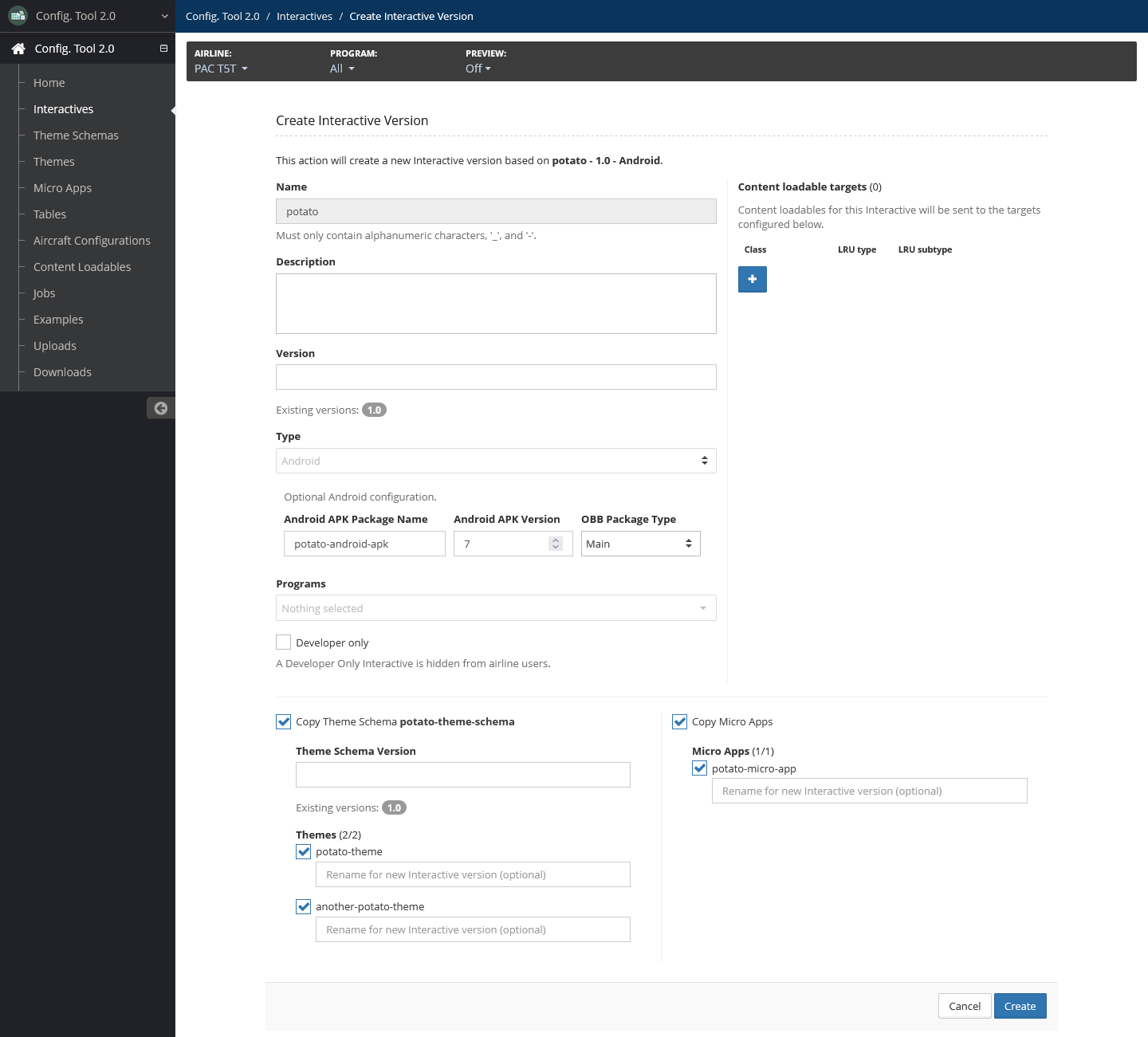
Select Create.
A list of components and the copy status displays. When all components have copied, select Close.
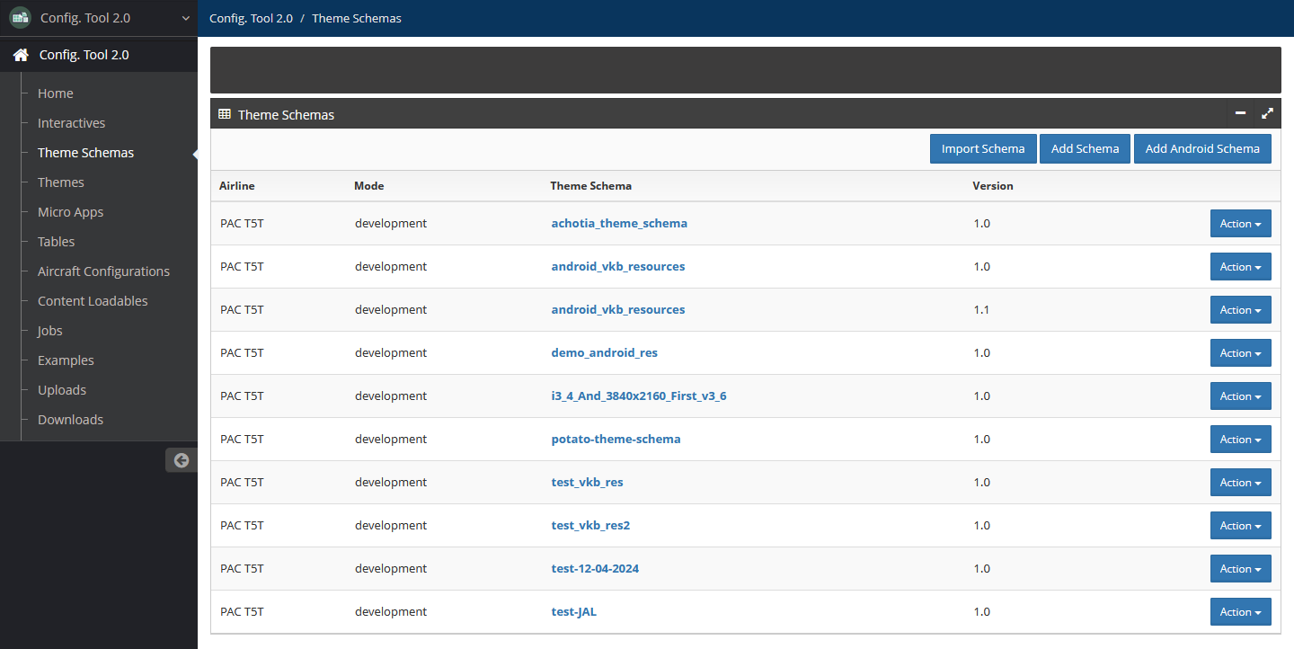
Theme Schemas
A theme schema is a template on which themes are based. Each interactive is associated with a theme schema.
For more information on theme schemas, refer to Theme Schemas. Only developers can access and manage theme schemas.
Access theme schemas by selecting Theme Schemas in the left navigation menu.
Create Theme Schema
Config Tool 2.0 provides the following methods for creating a theme schema:
Importing is the fastest and most accurate method to create a new theme schema. Once a theme schema is imported, you can edit the theme schema manually to make minor adjustments.
Import Theme Schema
To import a theme schema:
On the Theme Schemas page, select Import Schema.
Add the following details:
Theme Schema File — Required
Select Upload to browse to and select the schema import file from your system.
New Theme Schema Name — Required
Unique schema name that does not match any existing schemas, using only alphanumeric characters, underscores and hyphens.
Ignore Image Dimension — Optional
Select this checkbox to allow all image sizes. Leave unselected to enforce image width and height restriction.
This is unselected by default.
Assign to Interactive — Required
Select the interactive to which the schema applies.
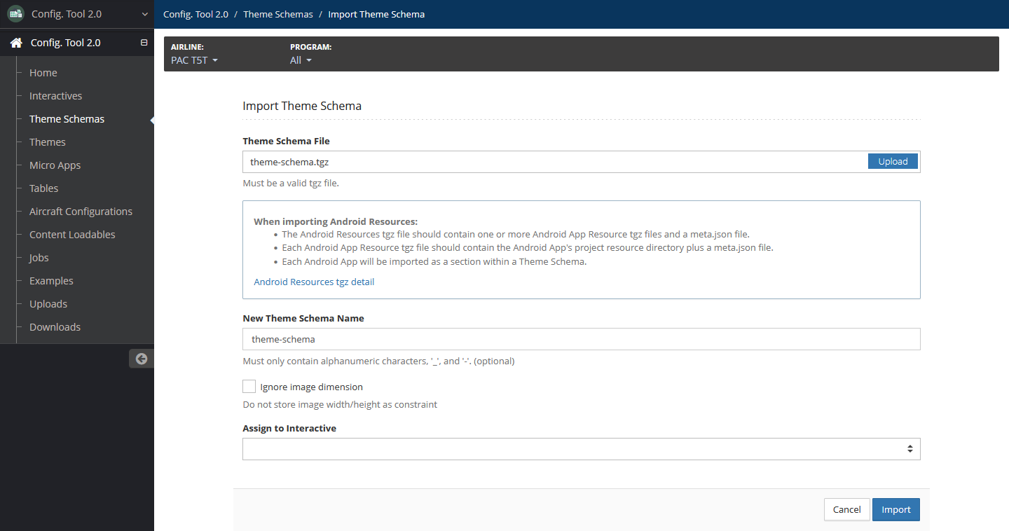
Select Import.
Manually Add Theme Schema
Use this method if you want to create the schema and add sections and properties manually.
This procedure creates a theme schema element in the tool. For additional information on adding theme schema properties, refer to Add Property.
There are two options to add schemas: Add Android Schema and Add Schema (for non-Android applications). Be sure to select the correct option for the type of schema you are creating.
To manually add a theme schema:
On the Theme Schemas page, select Add Schema for Qt interactives, or Add Android Schema for Android interactives.
Add the following details:
Name — Required
Enter the name of the theme schema using only alphanumeric characters, underscores and hyphens.
Version — Required
Enter the version of the theme schema.
Assign to Interactives — Optional
Select the interactives you want to associate the theme schema with, if any.
You can only select interactives that do not have an associated theme schema.
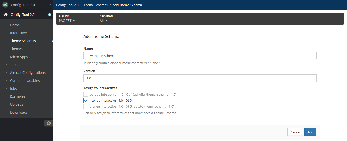
Select Add.
Add Language
To add a language to a theme schema:
In your working theme schema, select the Languages tab.
Select Add.
Enter the language code by doing any of the following:
If you know the two- or three-letter language code, you can manually enter it in the Language field.
If you need to look up an Android locale:
- Select a language and region from the Android Locales dropdowns. This automatically fills the field.
If you need to look up an ISO 639-3 language code, select an language from the ISO639-3 Languages dropdown. This automatically fills the field.
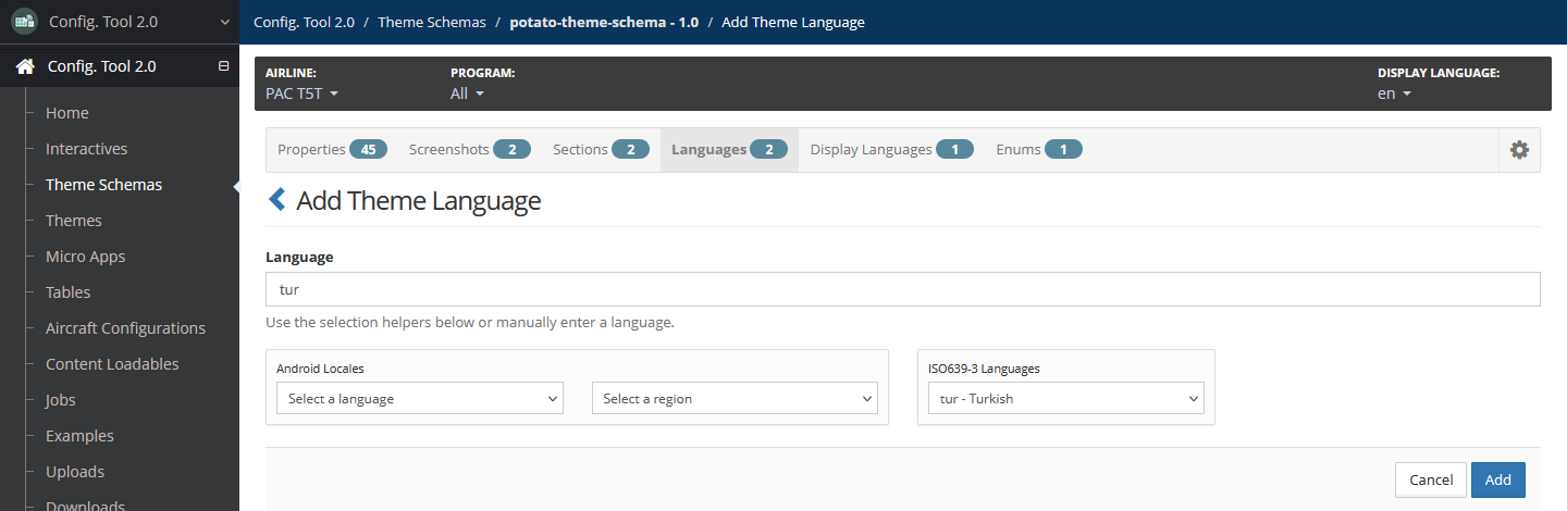
Select Add.
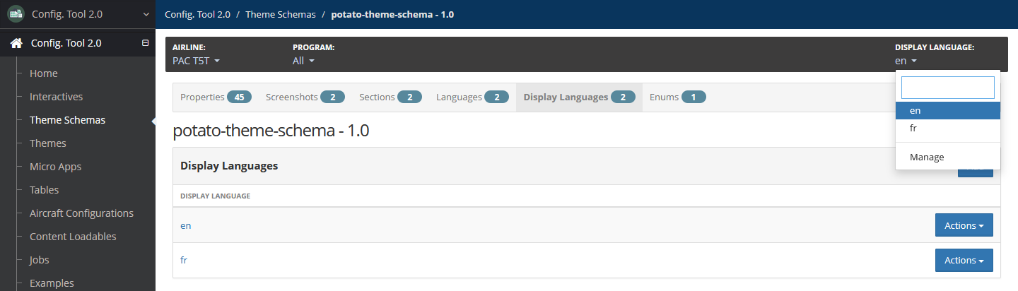
Add a Display Language
The display language allows you to localize the Config Tool 2.0 Theme UI pages. The default language is English, or en.
To add a display language:
In your working theme schema, select the Display Languages tab.
Select Add.
Enter the three-letter language code in the Language field, then select Add.
The language is added and displays in the Display Language dropdown list at the top.
Add Section
To add a theme schema section:
In your working theme schema, select the Sections tab.
Select Add, then add the following details:
Name — Required
Unique section name using only alphanumeric characters, underscores and hyphens. The maximum length is 25 characters.
Label — Optional
Label for the section. It is not required for the label to be unique from other section labels.
Description — Optional
Description of the section.
Export all images — Optional
Select this option to ensure all images are included when a related theme is exported. Leave unselected to only include referenced images.
This option is not applicable for Android themes.
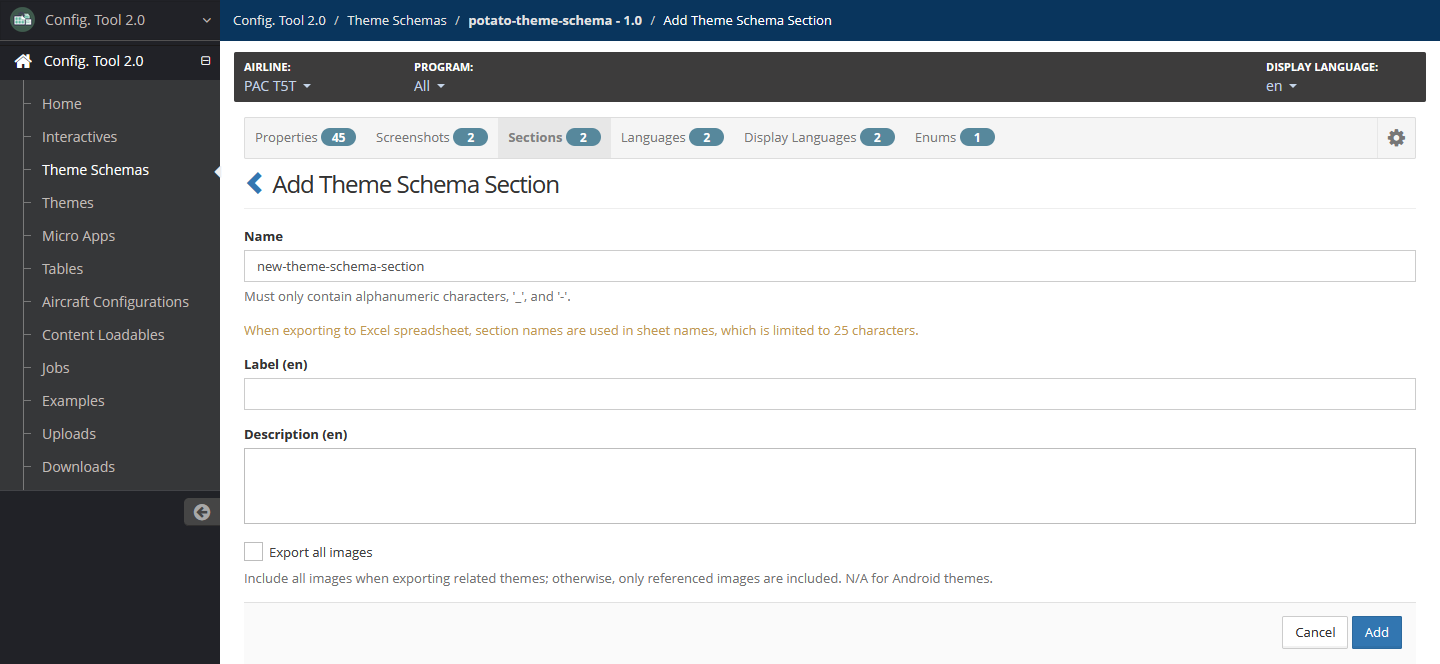
Select Add.
Import Section
Importing a theme schema section requires an already existing theme schema.
To import a theme schema section:
In your working theme schema, select the Sections tab.
Select Import.
Add the following details:
Theme Schema Section TGZ File — Required
Select Upload to browse to and select the TGZ file from your system.
Ignore Image Dimension — Optional
Select this checkbox to allow all image sizes. Leave unselected to enforce image width and height restriction.
This is unselected by default.
New Theme Schema Section Name — Required
Enter the name of the theme schema section.
Replace Section in Case of Name Conflict — Optional
Select this checkbox to automatically overwrite existing section data if the section already exists.
This is selected by default.
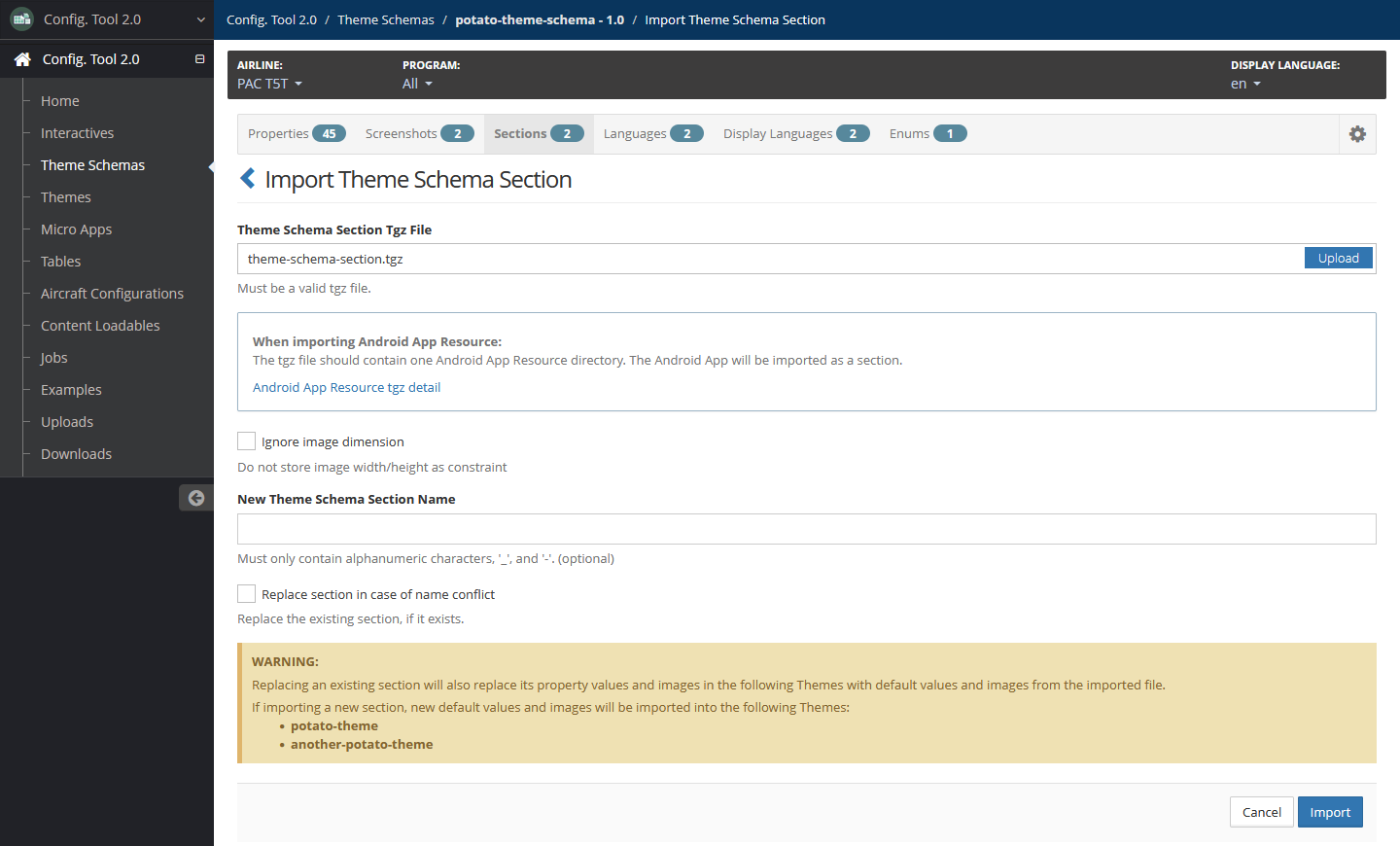
Select Import.
Views
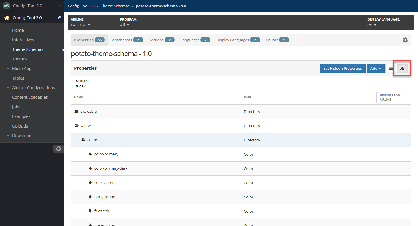
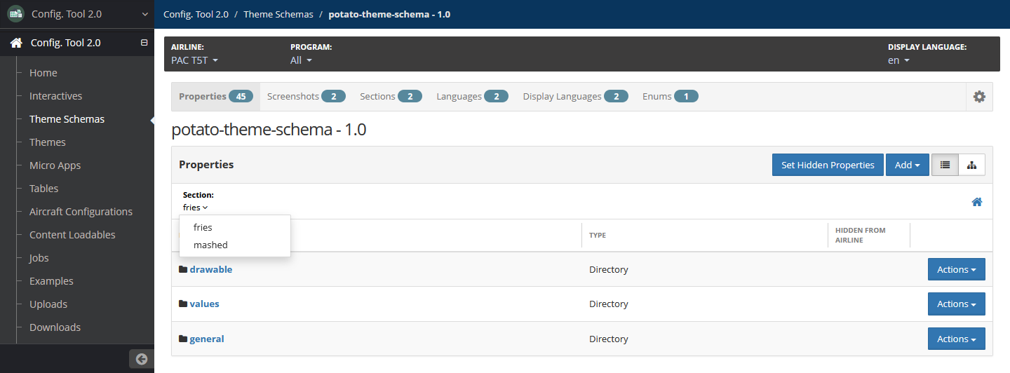
You can view properties in List View or Tree View.
In List View, you can view properties and directories at each directory level, starting from the top-level directory.
Selecting a directory allows you to view the properties and subdirectories in that directory. Use the breadcrumbs to identify in which directory you are.
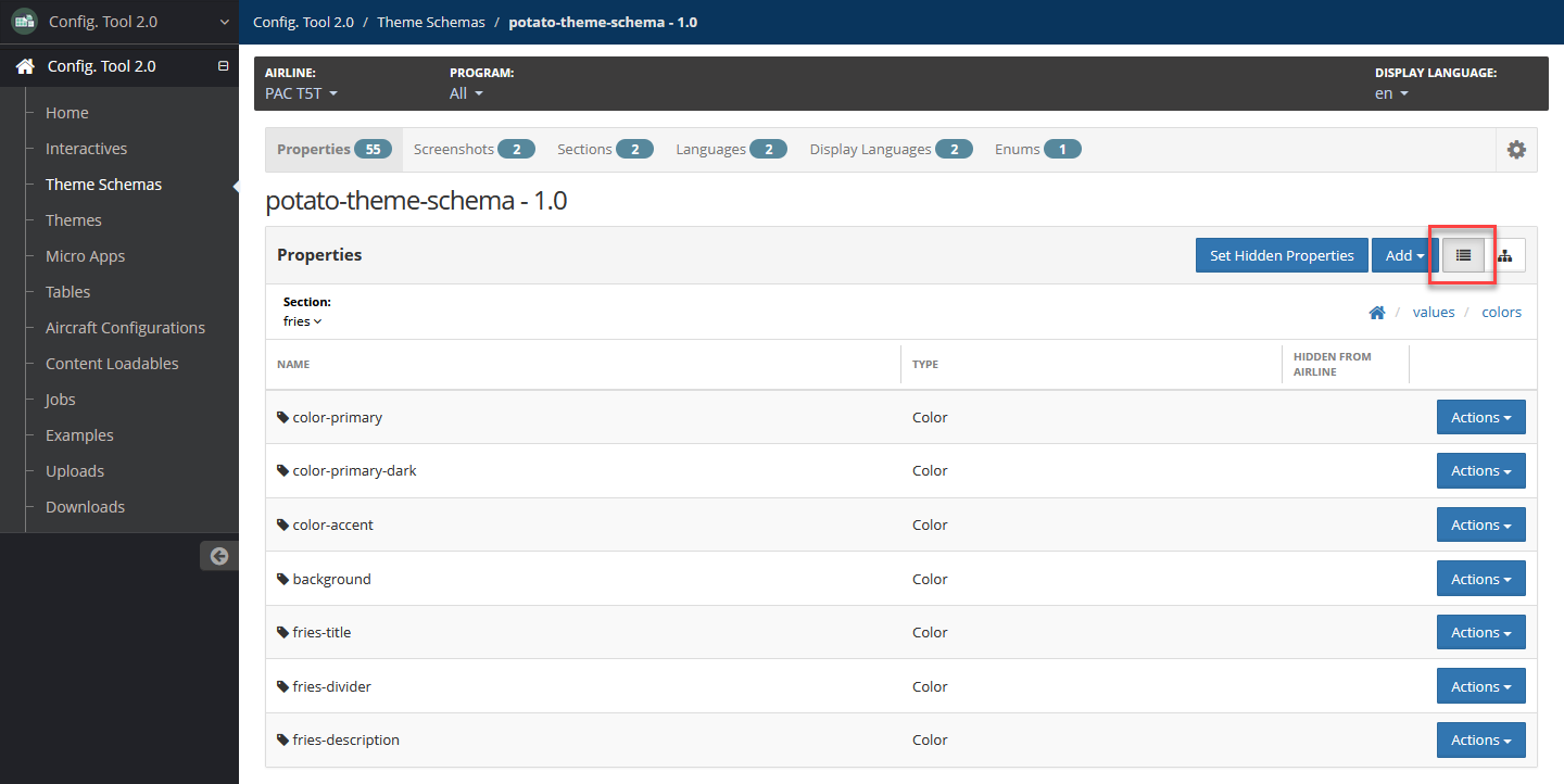
In Tree View, you can view all the properties and directories of the theme schema on the same page.
To expand a directory, double-click on a directory. You may also right-click on the directory, then select Collapse Others in the context menu, but this will both expand the directory and collapse all other directories that are open.
To expand all directories, select Expand All in the context menu. To collapse all directories, select Collapse All.
In tree view, you can also do the following:
Edit an individual property or a directory and its properties and subdirectories by editing the JSON. For more information, refer to Edit Property or Directory JSON.
Copy an individual property or a directory and its properties and subdirectories and paste into the same or different location. For more information, refer to Copy and Paste Property or Directory.
Move an individual property or directory and its properties and subdirectories to a different directory or a different place in the same directory. FOr more information, refer to Move Property or Directory.
Properties
Add Property
To add a property:
In your working theme schema, select the Properties tab.
From the Section dropdown, select the section to which you are adding the property.
Navigate to the directory where you want to add the property:
In list view, select the directory and subsequent subdirectories until you are located in the directory where you want to add the property.
In tree view, locate the directory or subdirectory. You may need to expand directories and subdirectories.
Go to the Add Theme Schema Property page by doing one of the following:
In list view, select Add, then select Property.
In tree view, right-click on the directory that will contain the property, hover over Add, then select Property.
If you are adding a Gradient property, select Color.
If you are adding a Plurals property, only Quantity properties that do not exist in the directory are available as options.
Add the following details:
Name — Required
Name of the property.
Label — Optional
Label for the property. It is not required for the label to be unique from other property labels.
Description — Optional
Description of the property.
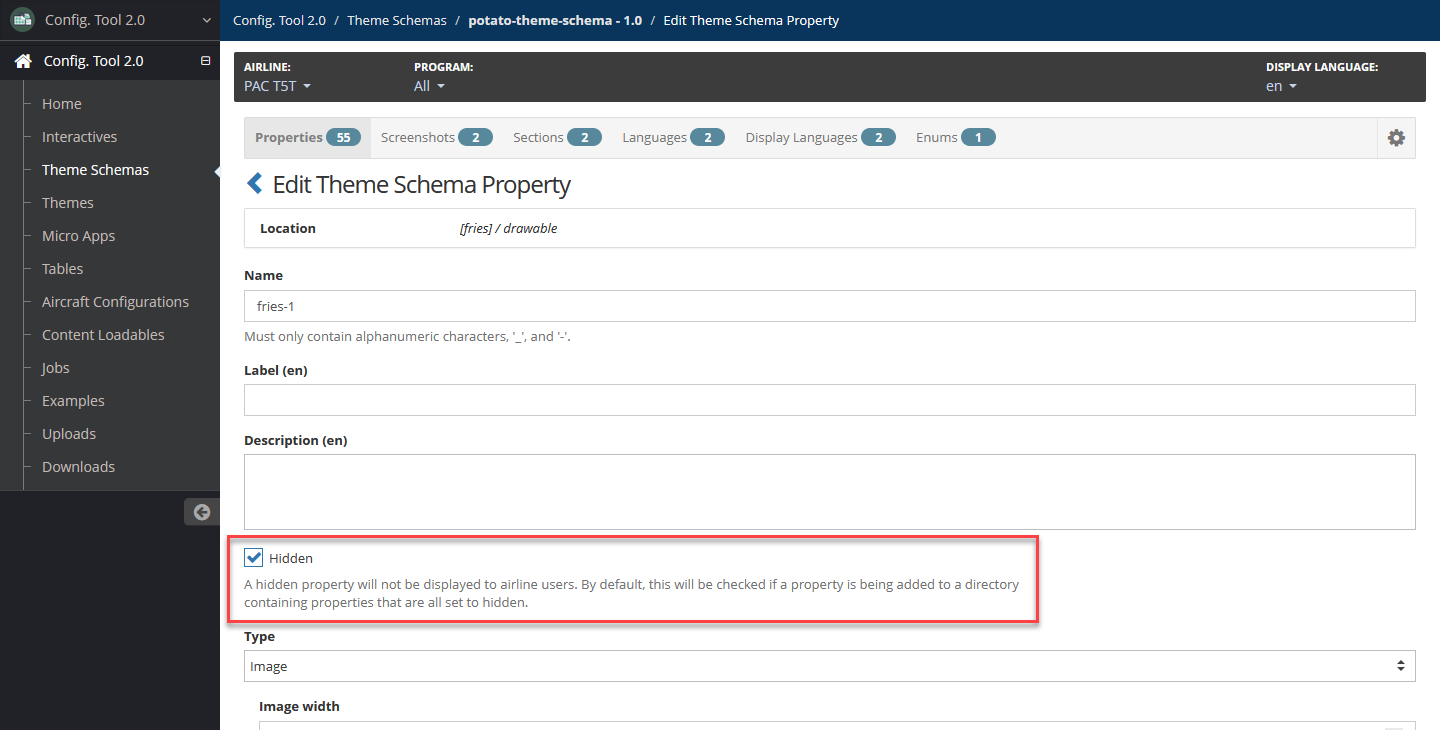
Hidden — Optional
Select this checkbox to hide this property from airline users. Leave unselected to keep the property available for airline users.
This is unselected by default.
Type — Required
Select an option and add details accordingly:
String — Alphanumeric text.
Optional attributes:
String Min — Minimum number of characters.
String Max — Maximum number of characters.
Int — Whole number integer.
Optional attributes:
Int Min — Minimum numeric value.
Int Max — Maximum numeric value.
Float — Floating point decimal.
Optional attributes:
Float Min — Minimum numeric value.
Float Max — Maximum numeric value.
Image — Image.
Optional attributes:
Image Width — Width in pixels.
Image Height — Height in pixels.
Color — Color code.
Boolean — True or False value.
Enum — Enumeration, or an ordered list of options. To create enums and set value options, refer to Enums.
Optional attributes:
- Enum — Select a value in the list.
Vector Image — No attributes available.
Select one or both of the following:
Main — Must be selected if I18N is not selected.
Select this checkbox to indicate that the property is in the main file.
Default — This displays if this checkbox is selected. Specify the property default value.
Note that there is no default value for a vector image.
I18n — Must be selected if Main is not selected.
Select this checkbox to indicate that the property is internationalized. Leave unselected to indicate that it is not internationalized.
Default — This displays if this checkbox is selected. Specify the property default value in each language associated with the theme schema. For additional information on how to add languages, refer to Add a Language.
Note that there is not default value for a vector image.
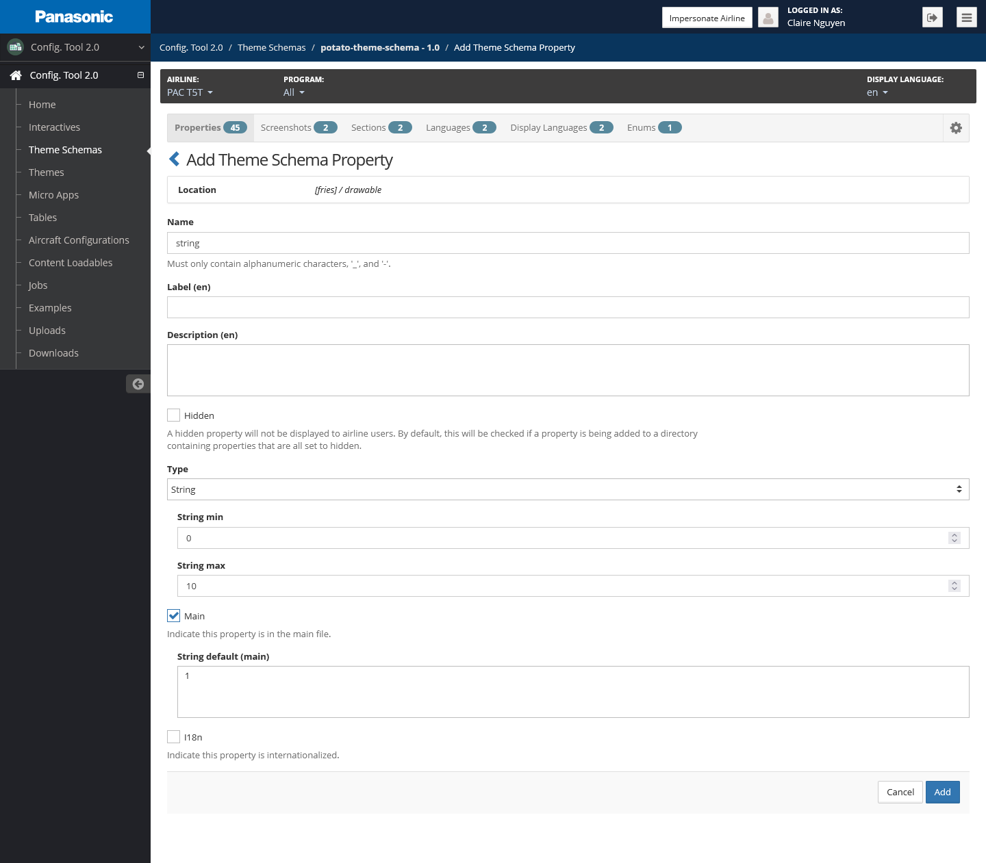
Select Add.
Edit Property
To edit a property:
In your working theme schema on the Properties page, navigate to the section containing the property.
Navigate to the property:
In list view, navigate to the directory containing the property.
In tree view, expand directories and subdirectories as needed to reveal the property.
Go to the Edit Theme Schema Property page by doing one of the following:
In list view, locate the property, then select Actions, then select Edit.
In tree view, right-click on the property. In the context menu that displays, select Edit.
To edit the details of the property, refer to step 5 of Add Property.
Select Update.
Delete Property
To delete a property:
In your working theme schema on the Properties page, navigate to the section containing the property.
Navigate to the property, then do one of the following:
In list view, select Actions, then select Delete.
In tree view, right-click on the property. In the context menu that displays, select Delete.
Confirm the deletion by selecting Delete.
Directories
Add Directory
To add a directory:
In your working theme schema on the Properties page, navigate to the section to which you are adding the directory.
You can add a top-level directory or a subdirectory. To add a subdirectory, navigate to the directory where the subdirectory is to be added:
In list view, select the directory and subsequent subdirectories until you are located in the directory where you want to add the property.
In tree view, locate the directory or subdirectory. You may need to expand directories and subdirectories.
Go to the Add Theme Schema Directory page by doing one of the following:
In list view, select Add, then select Directory.
In tree view, right-click on the directory that will contain the directory, hover over Add, then select Directory or Top-Level Directory.
Add the following details:
Name — Required
Name of the property.
Label — Optional
Label for the property. It is not required for the label to be unique from other property labels.
Description — Optional
Description of the property.
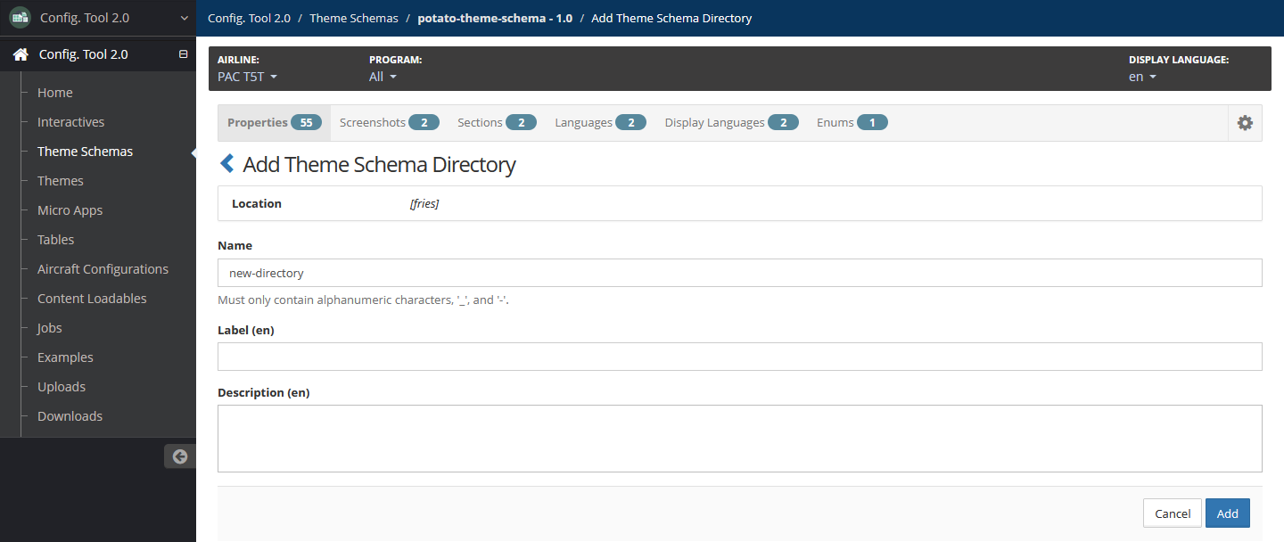
Select Add.
Edit Directory
To edit a directory:
In your working theme schema on the Properties page, navigate to the section containing the directory.
Navigate to the directory.
Go to the Edit Theme Schema Property page by doing one of the following:
In list view, locate the directory, then select Actions, then select Edit.
In tree view, located the directory, then right-click on the property. In the context menu that displays, select Edit.
Edit details of the directory as needed.
Select Update.
Delete Directory
To delete a directory or subdirectory:
In your working theme schema on the Properties page, navigate to the section containing the directory.
Navigate to the directory, then do one of the following:
In list view, select Actions, then select Delete.
In tree view, right-click on the directory. In the context menu that displays, select Delete.
Confirm the deletion by selecting Delete.
Gradients
Gradients are represented as directories and can be added the same way as normal directories. For information on managing directories, refer to Directories.
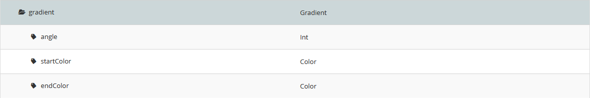
Gradients contain the following default properties:
angle — Integer indicting the angle of the gradient.
startColor — Starting color of the gradient.
endColor — Ending color of the gradient.
The above gradient properties cannot be deleted and their names and types cannot be modified. You can also add additional colors while in the gradient's directory the same way as adding normal properties, except the property type is set to Color. For more information, refer to Add Property.
Plurals
Plurals are represented as directories and can be added the same way as normal directories. For information on managing directories, refer to Directories.
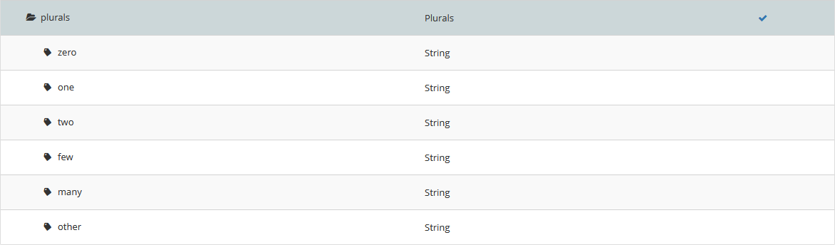
Plurals contain the following default string Quantity properties:
zero
one
two
few
many
other
The above properties can be deleted and re-added, but their names must be one of the above and can only be of string types. For more information on adding properties, refer to Add Property.
Edit Property or Directory JSON
You can edit an individual property or a directory and its properties and subdirectories by modifying and importing its JSON.
To edit JSON of a property or directory:
In your working theme schema on the Properties page, in the Section field, select the section you want to work with.
Navigate to the property or directory in tree view.
Right-click on the property or directory. In the context menu that displays, select Show JSON.
Modify the JSON as needed.
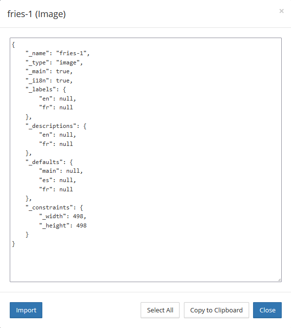
Select Import.
Copy and Paste Property or Directory
You can copy an individual property or a directory and its properties and subdirectories and paste into the same or different location.
To copy and paste a property or directory:
In your working theme schema on the Properties page, in the Section field, select the section you want to work with.
Navigate to the property or directory in tree view.
Right-click on the property or directory. In the context menu that displays, select Copy.
Right-click on the directory where you want to paste the property or directory that you copied. In the context menu that displays, select Paste ([property or directory]).
The property or directory is duplicated and added to the location you chose.
If a property or directory already exists in the location with the same name, the name is incremented by one. For example, the name of a copy of a directory named
dirisdir-1.
Move Property or Directory
To move an individual property, or directory and its properties and subdirectories, to a different directory or different place in the same directory:
In your working theme schema on the Properties page, in the Section field, select the section you want to work with.
Navigate to the property or directory in tree view.
To move the property or directory, drag and drop it into the new location. The new location can be a directory or subdirectory or a different place in the same directory.
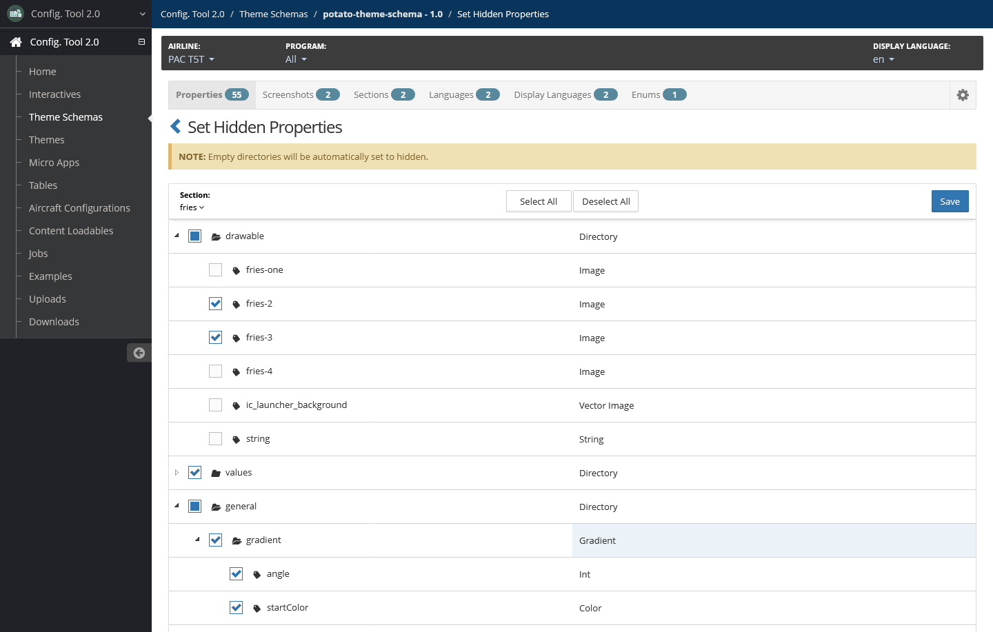
Set Property or Directory as Hidden
Config Tool 2.0 allows you to hide properties or directories so that they are not available to airline users.
Empty directories are automatically set to hidden.
You can hide properties or directories by doing either of the following:
Selecting the Hidden option when adding or editing a property. For more information, refer to Add Property.
Hiding through the Properties page. To do so, do the following:
In your working theme schema on the Properties page, select Set Hidden Properties.
Select the section that contains the properties or directories to hide.
Select the properties and directories you want to hide.
Select Save.
Enums
An enum, or enumeration, is an ordered list of options. A theme schema property can be set to an enum.
Add Enum
To add an enum:
In your working theme schema, select the Enums tab.
Select Add.
Enter a name.
To add values to the enum:
Select the + icon.
Enter an enum value into the text field.
Move an enum value to a new location by using the ↑↓ icon to drag and drop the value to a new location.
Continue adding values until you're finished.
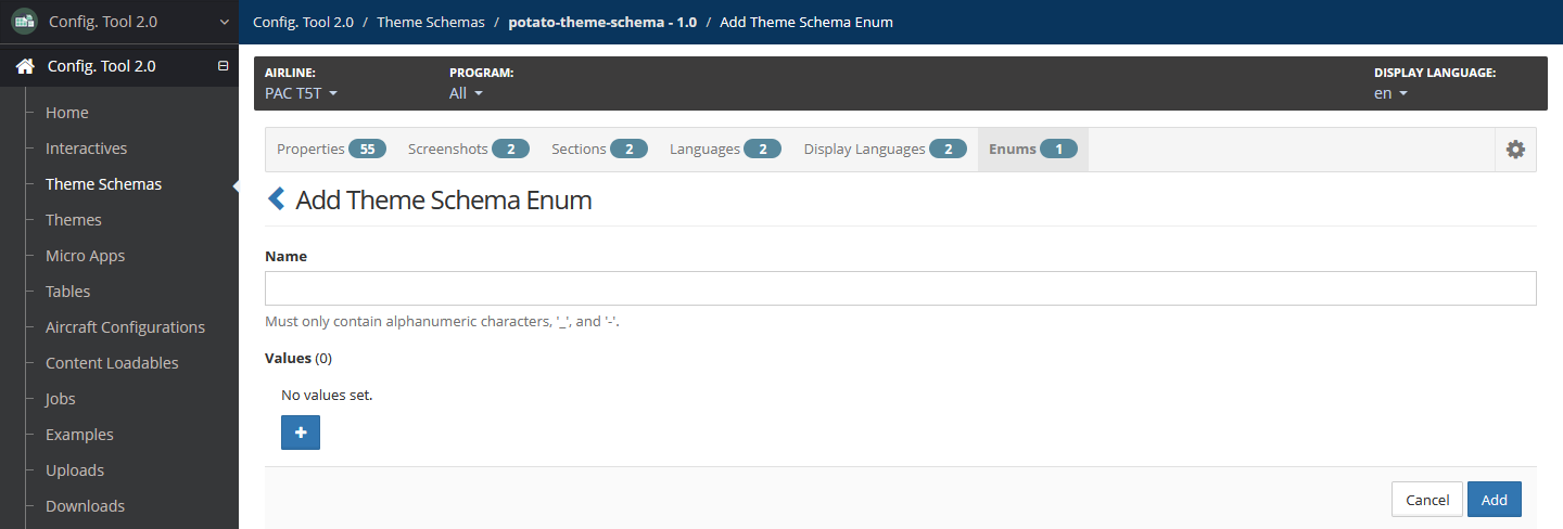
Select Add.
Edit Enum
To edit an enum:
In your working theme schema on the Enums page, locate the enum.
Select the enum, or select Actions, then Edit.
Update enum values as needed by doing any of the following:
Update an existing enum value.
Add a new enum value by selecting the + icon.
Remove a enum value by select the x icon next to the value to remove.
Move a enum value by using the ↑↓ icon to drag and drop the value to a new location.
Select Update.
Delete Enum
To delete an enum:
In your working theme schema on the Enums page, locate the enum.
Select Actions, then Delete.
Confirm the deletion by selecting Delete.
Delete Theme Schema
Deleting a theme schema deletes schema sections, properties and languages. It also deletes themes created from the theme schema.
To delete a theme schema:
On the Theme Schemas page, locate the theme schema that you want to delete.
Select Action, then select Delete.
Confirm the deletion by selecting Delete.
Create Theme Schema Version
Handle theme schema versions as you would a software release. Create a theme schema version only when there are substantive changes to the theme schema that are not compatible with the previous version.
Once created, the new version becomes the primary version — theme schema versions in Config Tool 2.0 are not intended to be backward compatible.
Creating a new theme schema version also requires creating new theme instances. themes based on the prior version are not compatible with the new theme schema version.
To create a theme schema version:
On the Theme Schemas page, locate the theme schema that which you want to create a version.
Select Action, then select Create Version.
Enter a version.
Select interactives that you want to associate with the new theme schema version. Only interactives that do not have a theme schema can be selected.
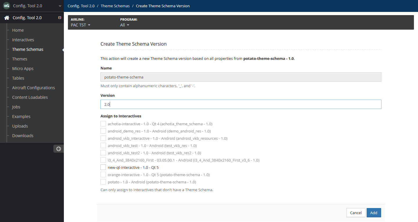
Select Add.
Screenshots
The Screenshot is a tool that assists airline users in maintaining the text and other properties associated with a UI page. Airline users work with screenshots using the Config Tool 2.0 GUI Config Assistant feature.
The following is an example of a screenshot as the airline user sees it.
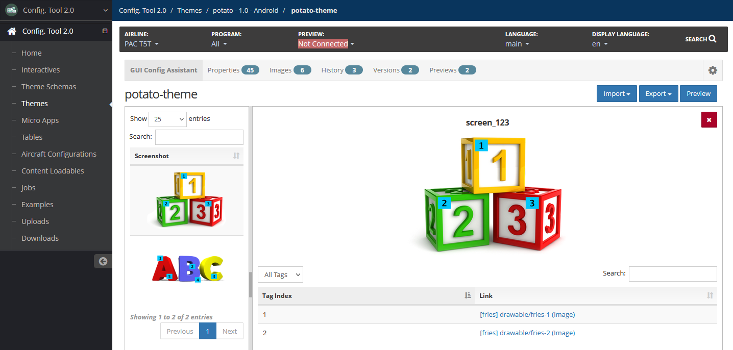
The numbered tags in the above image show the location of UI properties. Links to the properties display immediately after the image, allowing for easy access.
To set up a screenshot for airline users to maintain:
Create a spreadsheet to import into Config Tool 2.0.
Import the spreadsheet into Config Tool 2.0.
Link the image tags to theme schema properties if it hasn't already been provided in the spreadsheet.
Prepare Spreadsheet
To prepare a screenshot spreadsheet for importing:
In the left navigation menu, select Examples and download a copy of the GUI Config Assistant Screenshot Import example spreadsheet.
In the spreadsheet, add one spreadsheet tab for each UI page.
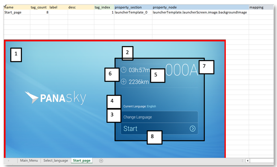
Provide values for each UI page as follows:
Name — Required
Name of the UI page, using only alphanumeric characters, underscores and hyphens. This must match the name on the spreadsheet tab.
Tag Count — Required
Number of properties displayed on the page.
Label — Optional
Label for the UI page.
Description — Optional
Description of the UI page.
Properties
The following properties can be left blank and linked later through Config Tool 2.0.
tag_index — Tag number as displayed in the image.
property_section — Theme schema section containing the property.
property_node — Full property pathname.
Import Screenshot Spreadsheet
To import a screenshot:
In your working theme schema, select the Screenshots tab.
Select Import.
Select Upload to browse to and select the spreadsheet file from your system..
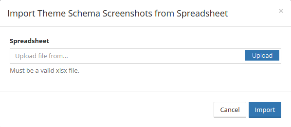
Select Import.
Link Properties to Tags
The last step in preparing a screenshot is to manually link the image tags to the theme schema properties in Config Tool 2.0.
Properties can be assigned to tags using the spreadsheet if needed.
To link properties to tags:
In your working theme on the Screenshots page, select the page name.
Update the following as needed:
Name — Required
Name of the UI page, using only alphanumeric characters, underscores and hyphens. This must match the name on the spreadsheet tab.
Screenshot — Select Upload to upload a new spreadsheet.
Label — Optional
Label for the UI page.
Description — Optional
Description of the UI page.
Tag Count — Required
Number of properties displayed on the page.
Link each tag as follows:
Select Add.
Enter the tag number in the Tax Index field.
Link to a property by doing either of the following:
To link through the Properties tab:
Select the theme schema section from the Section dropdown.
Select the property, then select Add.
To link through the Properties Tables tab:
Enter the property name in the Search field.
Select the property, then select Add.
Link to another screenshot:
Select the Screenshots tab.
Select a screenshot in the list, then select Add.
Select Update.
Export Screenshot
This procedure exports the screenshot and properties to a spreadsheet file.
To export a screenshot:
In your working theme schema, select the Screenshots tab.
Select Export.
The screenshot is exported to a spreadsheet file.
Remove Screenshot
In your working theme schema, select the Screenshots tab.
Select the screenshot to remove, then select Remove.
Confirm the removal by selecting Remove.
Themes
A theme is a copy of a theme schema intended for a particular audience or purpose.
For more information on themes, refer to Themes. The following are other available standard functionalities not detailed on this page:
Access themes by selecting Themes in the left navigation menu.
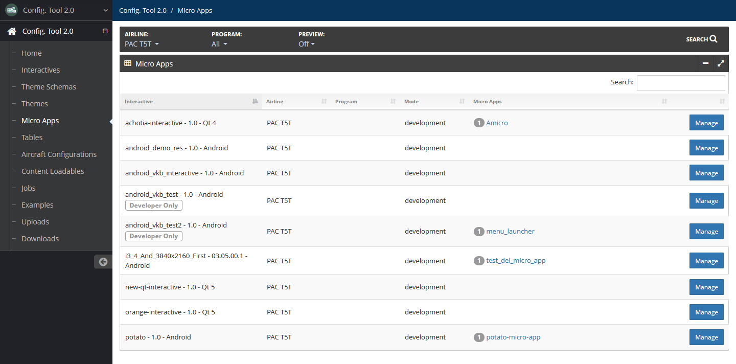
Micro Apps
Micro Apps are applications with limited user interaction, commonly used for display-only pages similar, such as About Our Airline or Contact Us pages.
For more information on micro apps, refer to Micro Apps. The following are other available standard functionalities not detailed on this page:
Access micro apps by selecting Micro Apps in the left navigation menu.
Import Micro App
To import a micro app to an interactive:
On the Micro Apps page, locate the interactive to associate the micro app, then select Manage.
Select Import.
Add the following details:
Micro App File — Required
Select Upload to browse to and select the micro app TGZ file from your system.
New Micro App Name — Required
Unique micro app name using only alphanumeric characters, underscores and hyphens.
Label — Optional
Label for the micro app. It is not required for the label to be unique from other micro app labels.
Export Type — Required
Type of file when the micro app is exported.
The default is XML.
Description — Optional
Description about the micro app.
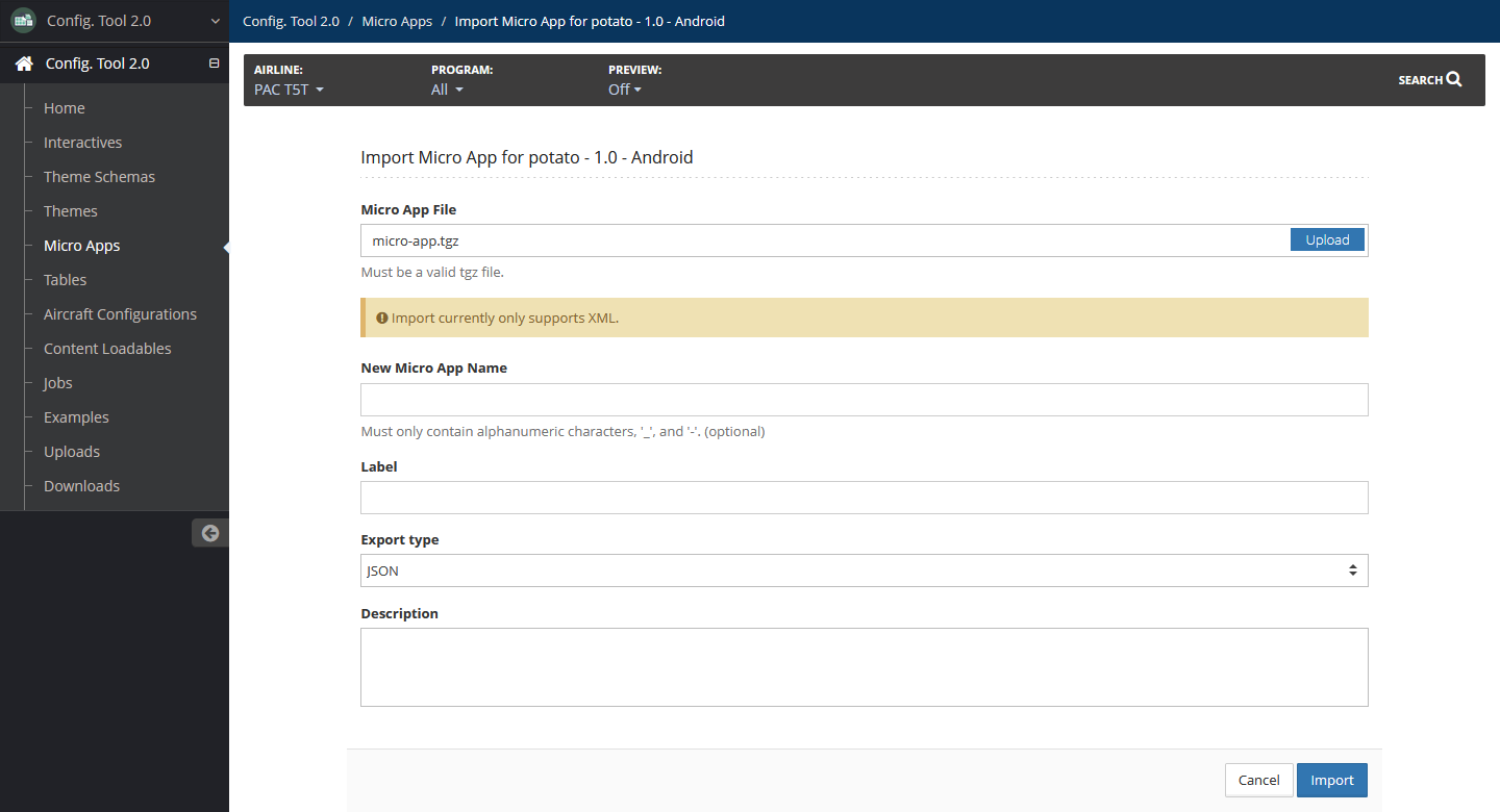
Select Import.
Add Micro App
To add a micro app:
On the Micro Apps page, locate the interactive to associate the micro app, then select Manage.
Select Add.
Add the following details:
Name — Required
Name of the micro app using only alphanumeric characters, underscores and hyphens.
Label — Optional
Label for the micro app. It is not required for the label to be unique from other micro app labels.
Export Type — Required
Type of file when the micro app is exported.
The default is XML.
Disable triggers — Optional
Select this checkbox to disable triggers. Leave unselected to keep triggers enabled.
If this checkbox is selected, triggers cannot be edited or exported.
The default is unselected.
Developer only — Optional
Select this checkbox to indicate that the micro app is for developer use only.
The default is unselected.
Description — Optional
Description about the micro app.
Logo Image — Optional
Select Change to browse to and select the image file from your system.
Select Clear to remove the image.
For Android Micro Apps, enter the following Android package information:
Android APK Package Name
Android APK Version
OBB Package Type
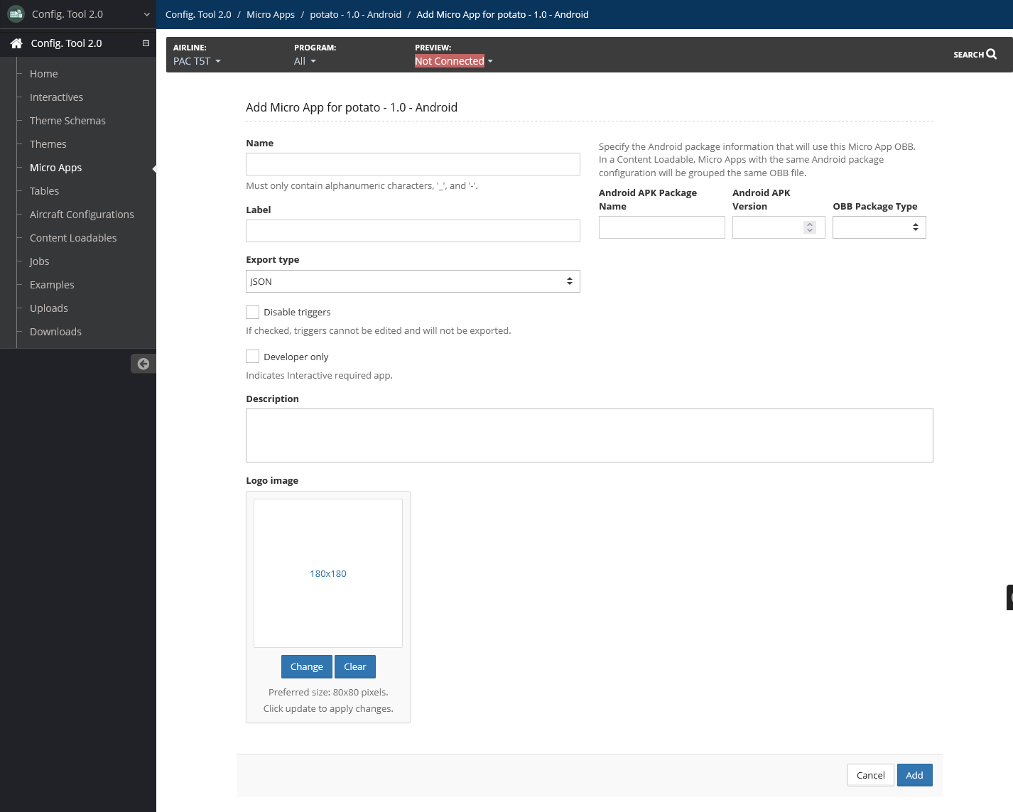
Select Add.
Micro App Templates
Micro App Template Elements
The following are elements available for micro app templates:
| Element | Description | Screen | List Item | App |
|---|---|---|---|---|
| Text | Any string text. | ✓ | ✓ | ✓ |
| Image | You can import PNG or JPG images. For more information on adding and managing images, refer to Images. | ✓ | ✓ | ✓ |
| Color | Select a color using the interactive color selector or manually enter the hexadecimal value of a color with optional alpha values. | ✓ | ✓ | |
| List | Select a list item element. | ✓ | ||
| Link | Any URL. | ✓ | ✓ | |
| Child App Link | A link to another child app. | ✓ | ✓ | |
| Enum | An enum, or enumeration, offers a choice of several options. To set the enum, you can select an option from the dropdown. | ✓ | ✓ |
Each element has the following possible fields that can be configured:
Name — Required
Unique name of the element.
Label — Optional
Label for the element. It is not required for the label to be unique from other micro app labels.
i18n — Optional
Select this checkbox if the element is internationalized. Leave unselected if it is not.
If selected, selected a language from the provided list.
Default — Required if the element is not internationalized
Default text. Add text to this field if the element is not internationalized.
This field is only available for text, color, link, child app link, and enum elements.
Template — Required for list elements
Select a list template from the provided list template options.
This field is only available for list elements.
Enum — Required for enum elements
Select an enum from the provided enum options.
This field is only available for enum elements.
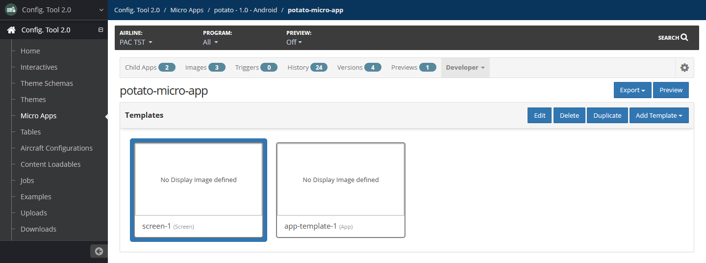
Add Micro App Template
To add a micro app template:
In your working micro app, select the Developer dropdown tab, then select Templates.
Select Add Template, then select Screen, List Item or App.
Add the following details about the template:
Name — Required
Name of the template. This must start with a letter, then followed by only alphanumeric characters and hyphens.
Display Image — Optional
Select Browse to browse to and select an image file from your system.
Template Id — Required
Unique template ID using only alphanumeric characters, underscores and hyphens.
Label — Optional
Label for the template. It is not required for the label to be unique from other micro app labels.
Attributes — Optional
Name — Template attribute name
Value — Template attribute value
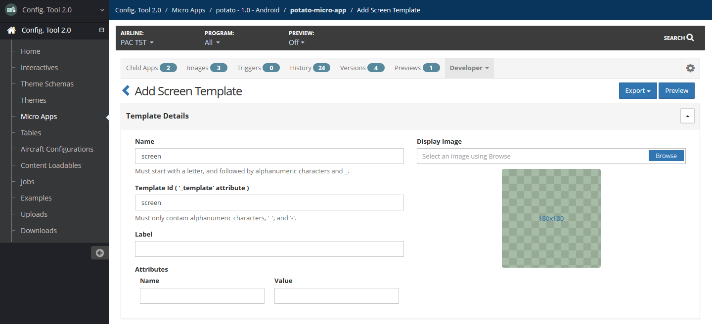
Each template type has different elements that are available to add:
To remove an element, select the ≡ icon of the element, then select Delete.
To change the order of the elements, drag and drop the element to the location you want.
When you are ready, select Add.
Add Screen Template Elements
A screen template has two columns, right and left. For each column, add a display label in the Column Label field, such as Settings or Content.
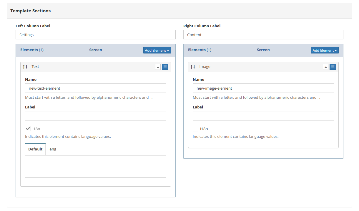
To add an element to a column, select Add Element, then select the element type. The following are elements available to add to a screen template:
Text
Image
Color
List
Link
Child App Link
Enum
For more information on how to set an element, refer to Micro App Template Elements.
Move an element from one column to the other by selecting the ≡ icon of the column the element is currently in, then select Move to Right Column or Move to Left Column accordingly.
Add List Item Template Elements
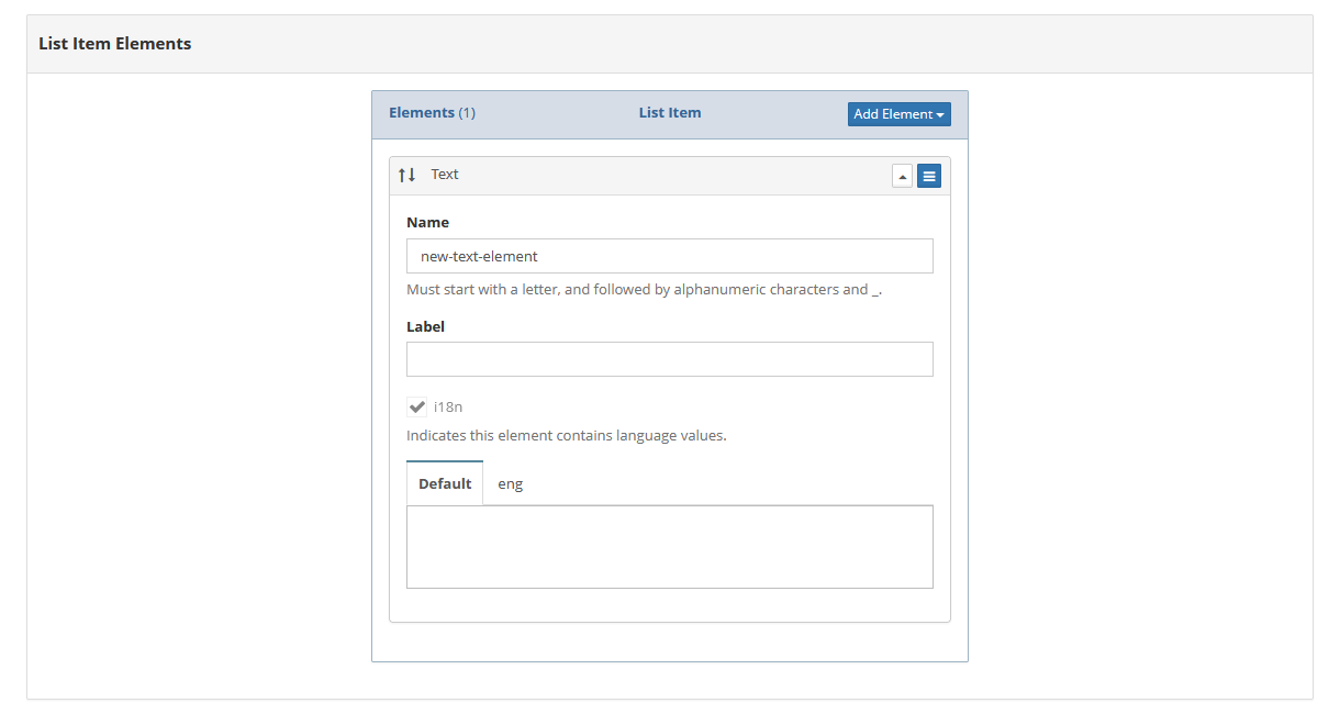
To add an element to the list item template, select Add Element, then select the element type. The following elements are available to add to a list item template:
Text
Image
Color
Link
Child App Link
Enum
For more information on how to set up an element, refer to Micro App Template Elements.
Add App Template Elements
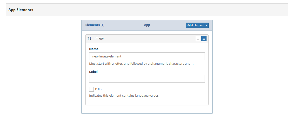
To add an element to the app template, select Add Element, then select the element type. The following elements are available to add to an app template:
Text
Image
For more information on how to set up an element, refer to Micro App Template Elements.
Edit Template
To edit a micro app template:
In your working micro app, select the Developer dropdown tab, then select Templates.
Select the template to edit, then select Edit.
Modify details as needed.
Select Update.
Duplicate Template
To duplicate a micro app template:
In your working micro app, select the Developer dropdown tab, then select Templates.
Select the template to edit, then select Duplicate.
Add a new template ID.
Select Duplicate.
Delete Template
To delete a micro app template:
In your working micro app, select the Developer dropdown tab, then select Templates.
Select the template to edit, then select Delete.
Confirm the deletion by selecting Delete.
Edit Micro App
To edit a micro app:
On the Micro Apps page, locate the interactive to associate the micro app, then select Manage.
Locate the micro app to edit. Select Action, then select Edit.
Edit details as needed.
Select Update.
Delete Micro App
To delete a micro app:
On the Micro Apps page, locate the interactive to associate the micro app, then select Manage.
Locate the micro app to edit. Select Action, then select Delete.
Confirm the deletion by selecting Delete.
Tables
Tables can be used to display data, such as strings, integers, images or enums.
For more information on tables, refer to Tables. The following are other available standard functionalities not detailed on this page:
Access tables by selecting Tables in the left navigation menu.
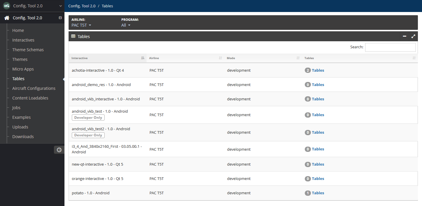
Table Schemas
Table schemas define the structure of tables. These can be imported and exported in Excel spreadsheet format or manually created.
Import Table Schema
The table schema import file must be in Excel spreadsheet (.xlsx) format.
To import a table schema:
On the Tables page, locate the interactive to associate the table schema, then select the Tables.
Select the Schemas tab.
Select Import, then select From Spreadsheet.
Select Upload to browse to and select the table schema spreadsheet file from your system.
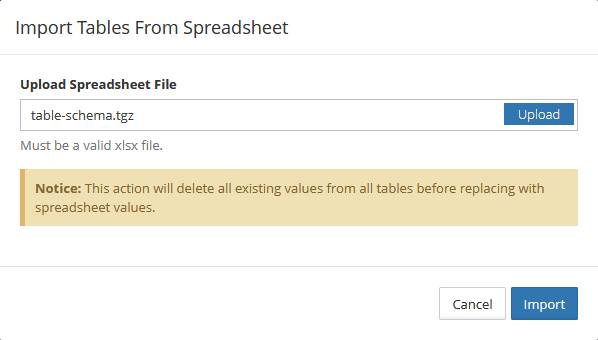
Select Import.
Add Table Schema
To manually add a table schema:
On the Tables page, locate the interactive to associate the table schema, then select the Tables.
Select Add.
Enter the name of the table schema using only alphanumeric characters and underscores. The length can be up to 31 characters.
To add or modify columns:
Add a column by selecting Add Column. Enter the name of the column using only alphanumeric characters and underscores, then select the column type.
Delete a column by locating the column and selecting Delete.
Reorder columns by using the ↑↓ icon of a column to drag and drop the column to a new location.
To add or delete a view:
Add a view by selecting Add View. Enter the name of the view using only alphanumeric characters and underscores.
Delete a view by locating the view and selecting Delete.
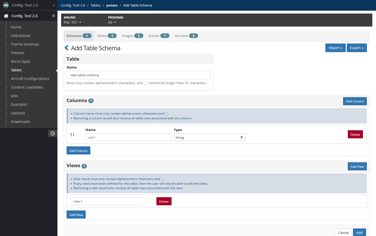
Select Add.
Edit Table Schema
To edit a table schema:
In your working table, select the Schemas tab and locate the schema you want to edit.
Select Actions, then select Edit.
Edit the name of the table schema, columns and views as needed.
Select Update.
Export Table Schemas
To export all table schemas of an interactive, on the Schemas page, select Export, then select one of the following:
To Sqlite
To Spreadsheet
To OBB (only available for Android interactives)
Delete Table Schema
To delete a table schema:
In your working table, select the Schemas tab.
Locate the schema you want to edit, select Actions, then select Delete.
Confirm the deletion by selecting Delete.
Enums
Add Enum
To add an enum:
In your working table, select the Enums tab, then select Add.
Add the following details:
Name — Required
Name of the enum using only alphanumeric characters, underscores and hyphens.
Values
Add enum values by selecting the + icon, then adding a value to the provided field.
Remove an enum value by select the x icon next to the value to remove.
Reorder enum values by using the ↑↓ icon of an enum to drag and drop the value to a new location.
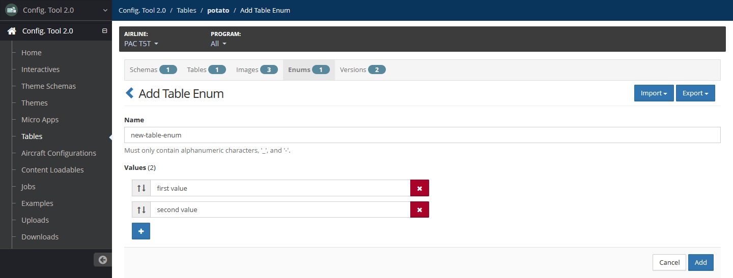
Select Add.
Delete Enum
To delete an enum:
In your working table on the Enums page, locate the enum to delete.
Select Actions, then select Delete.
Confirm the deletion by selecting Delete.
Versions
Delete Version
To delete a table version:
In your working table, select the Versions tab.
Locate the version to delete. Select Action, then select Delete.
Confirm the deletion by selecting Delete.
Aircraft Configurations
Aircraft configurations define which interactives are used with a specific aircraft type. Configurations are set up during interactive development and are used when creating content loadable files.
For more information on aircraft configurations, refer to Aircraft Configurations. Only developers can set up and maintain aircraft configurations.
Access aircraft configurations by selecting Aircraft Configurations in the left navigation menu.
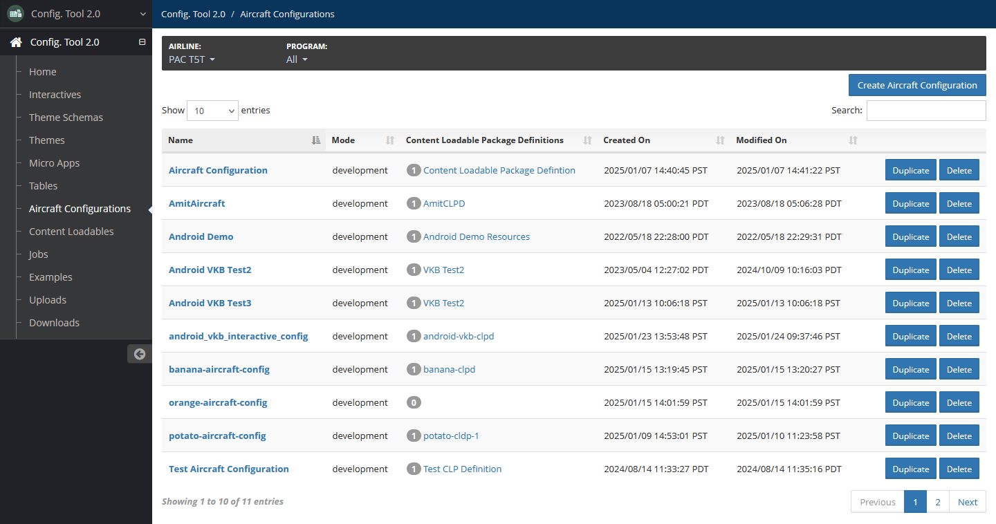
Create Aircraft Configuration
To create an aircraft configuration:
On the Aircraft Configurations page, select Create Aircraft Configuration.
Add the name of the aircraft configuration, and select the interactives to be included in the configuration.
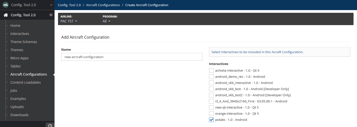
Select Add.
Edit Aircraft Configuration
To edit an aircraft configuration:
In your working aircraft configuration, select the ⚙ icon, or from the Aircraft Configurations page, select the aircraft configuration.
Modify details as needed.
Select Update.
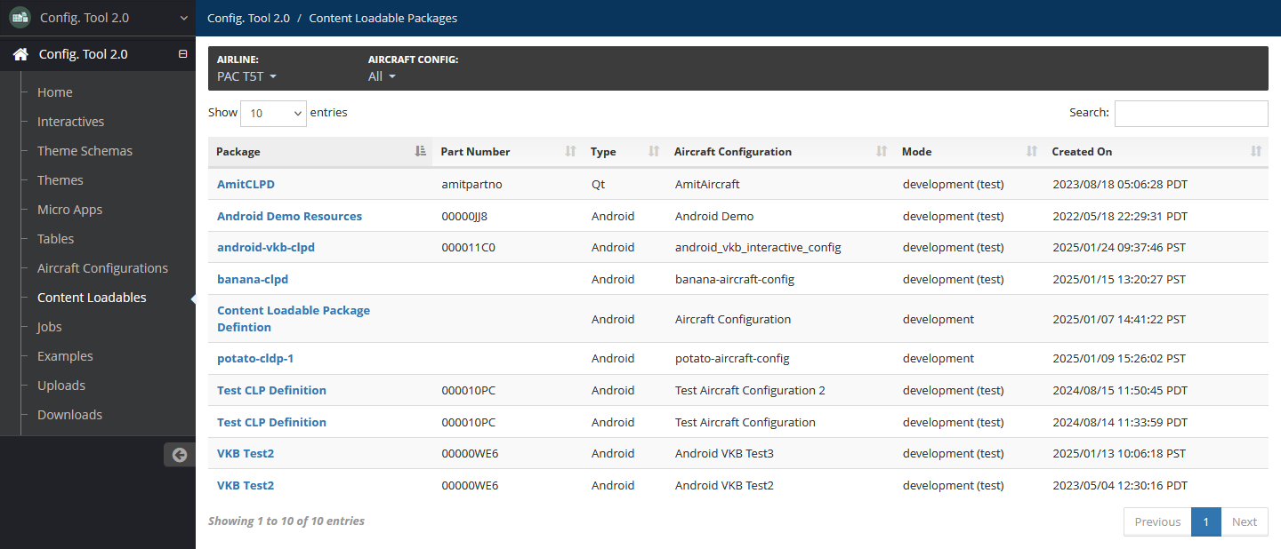
Content Loadable Package Definitions
After creating the aircraft configuration, the tool displays the Content Loadable Package Definitions page of the aircraft configuration. This page can also be accessed by selecting the aircraft configuration and selecting the Content Loadable Package Definitions tab.
Create Content Loadable Package Definition
To create a content loadable package definition:
In your working aircraft configuration on the Content Loadable Package Definitions page, select Create Definition, then select one of the following:
Qt
Android
Legacy Qt Config Tool
Add the following details:
Name — Required
Name of the content loadable package definition.
Test Mode — Optional
Select this checkbox to indicate that this definition is in test mode.
The default is selected.
Automatically request a Part Number from SCM — Optional
Select this checkbox to request a part number from SCM. If this is selected, select a Folder Name from the provided dropdown.
Part Number (manually) — Optional
Manually enter a valid part number.
Theme Sections — Available for Android definitions only
Select theme sections to be included. Only sections that have not been selected for existing content loadable package definitions are available.
Theme Interactives — Available for Qt and Legacy Qt Config Tool definitions only
Select Qt theme interactives to be included. Only theme interactives that have not been selected for existing content loadable package definitions are available.
Micro Apps — Available for Android, Qt and Legacy Qt Config Tool definitions.
Select micro apps to be included. Only micro apps that have not been selected for existing content loadable package definitions are available.
Table Interactives — Available for Android definitions only
Select table interactives to be included. Only table interactives that have not been selected for existing content loadable package definitions are available.
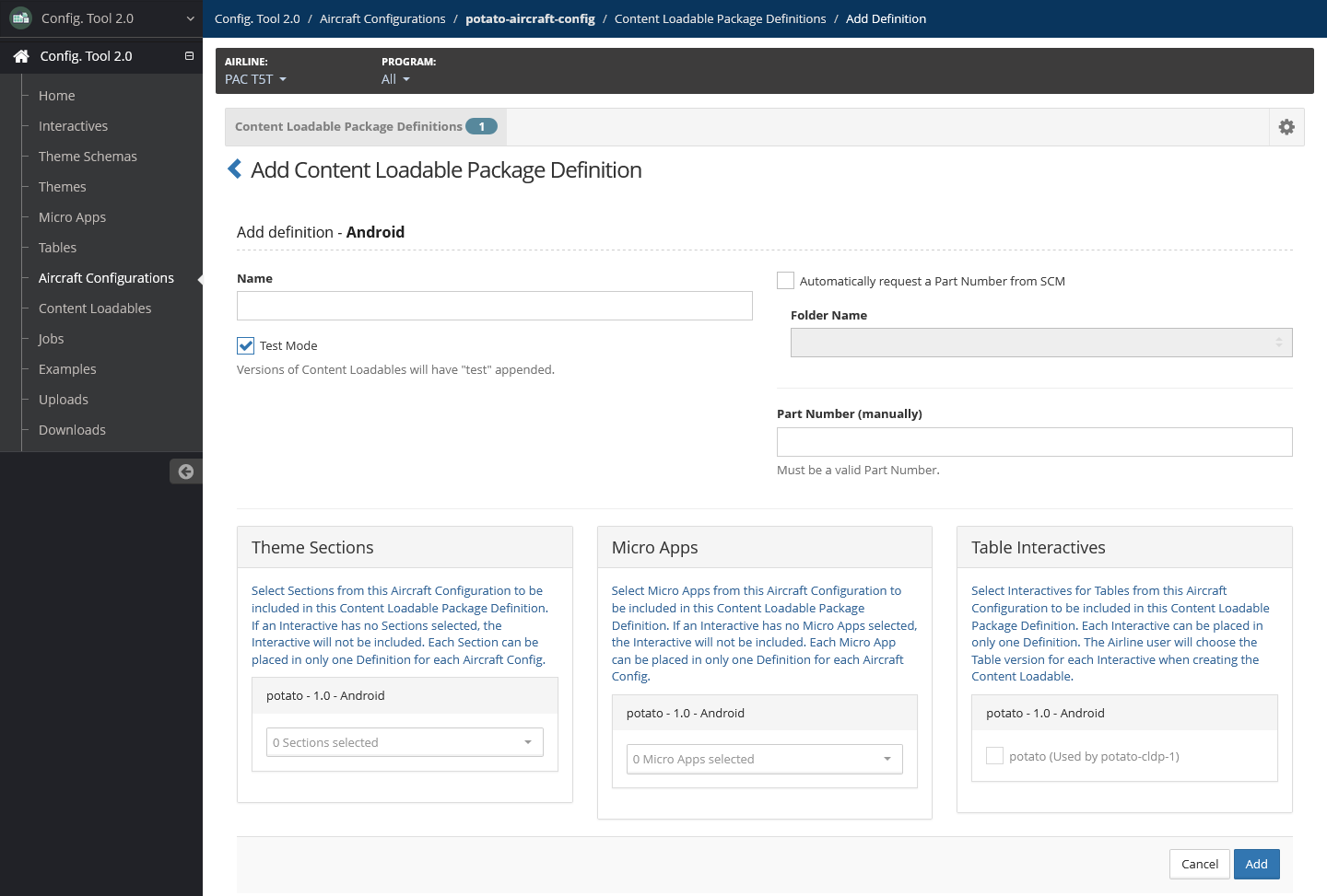
Select Add.
Edit Content Loadable Package Definition
To edit a content loadable package definition:
In your working aircraft configuration on the Content Loadable Package Definitions page, select the content loadable package definition from the list. This displays the edit page.
Modify details as needed.
To request a part number, select Request Part Number.
Select Update.
Delete Content Loadable Package Definition
To delete a content loadable package definition:
In your working aircraft configuration on the Content Loadable Package Definitions page, locate the content loadable package definition to delete, then select Delete.
Confirm the deletion by selecting Delete.
Previews
The preview feature is an optional Windows PC program package that Panasonic supplies. This shows you how an interactive, micro app or child app displays using a specific theme.
Developer users can set up the Preview Manager for airline users.
For more information on previews, refer to Previews. The following are other available standard functionalities not detailed on this page:
Preview Manager Setup
The Skeleton Preview Package example contains the Preview Manager and instructions for setting it up.
To access the instructions:
In the left navigation menu, select Examples.
Locate Skeleton Preview Package.
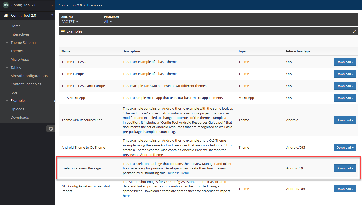
Select Download, then select one of the download options to download the package.
Open the downloaded package, then open the
developers_readmefile to view instructions on installing the Preview Manager.
Content Loadables
A content loadable is a set of digital files that can be distributed to an aircraft.
For more information on content loadables, refer to Content Loadables. The following are other available standard functionalities not detailed on this page:
Access content loadables by selecting Content Loadables in the left navigation menu.
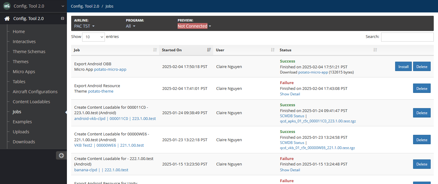
Jobs
Background jobs are run for different builds, such as creating content loadable packages and exporting themes.
For more information on jobs, refer to Jobs.
Access jobs by selecting Jobs in the left navigation menu.
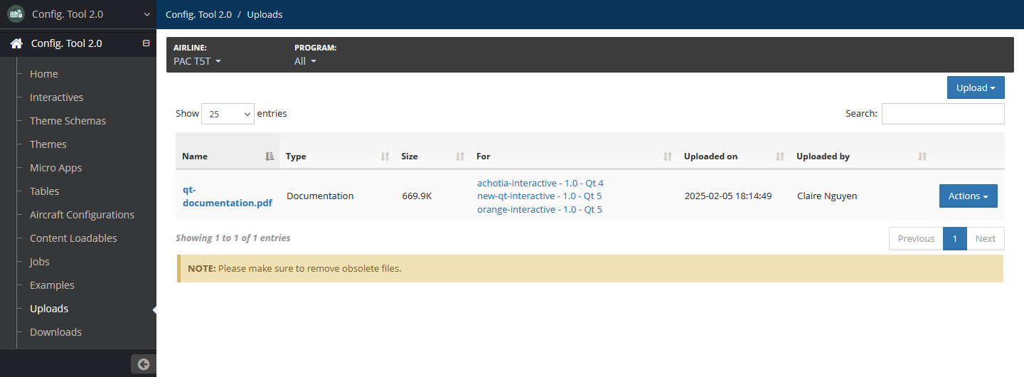
Uploads
Developers can upload files that other users can download as needed.
Be sure to periodically delete obsolete or unused upload files.
For more information on uploads, refer to Uploads. For more information on downloads, refer to Downloads.
Access uploads by selecting Uploads in the left navigation menu.
Upload File
To upload a file:
On the Uploads page, select Upload, then select PC Demo or Documentation.
Select Upload to browse to and select the file in your system.
Add a description if needed.
Select interactives to associate with the upload file. At least one interactive must be selected.
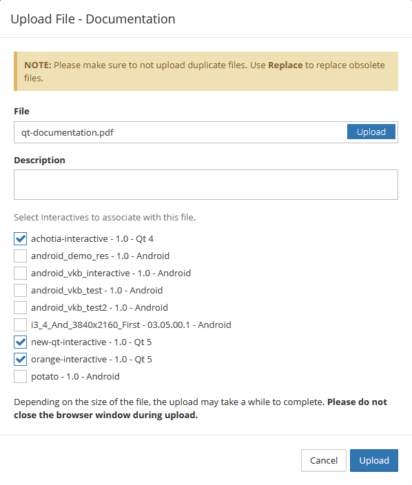
Select Upload.
Edit and View Details of Uploaded File
To edit and view details of an uploaded file:
On the Uploads page, locate the file. Select Actions, then select Edit.
Details of the upload file, such as the size, upload date and the user who uploaded the file, are displayed at the top.
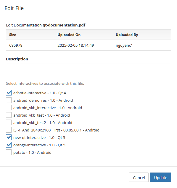
Modify the description and select the correct interactives to associate the file, if needed.
Select Update.
Replace Uploaded File
To replace an uploaded file:
On the Uploads page, locate the file. Select Actions, then select Replace.
Select Upload to browse to and select the replacement file.
Add a description if needed.
Select interactives to associate with the replacement file. If any interactives were previously selected, they cannot be unselected. At least one interactive must be selected.
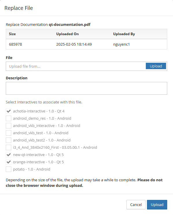
Select Upload.
Delete Uploaded File
To delete an uploaded file:
On the Uploads page, locate the file. Select Actions, then select Delete.
Confirm the deletion by selecting Delete.
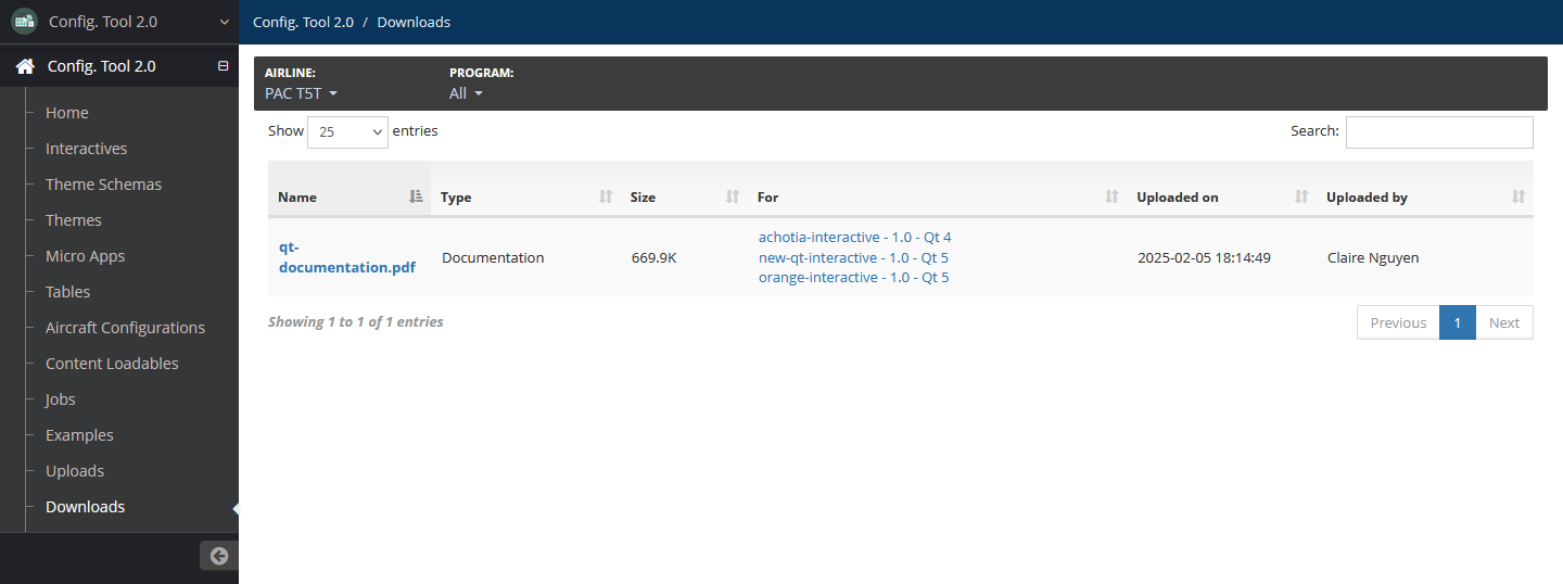
Downloads
The download feature allows developer users to upload and distribute files and updates among Config Tool 2.0 users.
For more information on downloads, refer to Downloads. For more information on uploads, refer to Uploads.
Access downloads by selecting Downloads in the left navigation menu.