Android Virtual Keyboard Developer Guide
The Panasonic Android Virtual Keyboard (VKB) is a multilingual predictive virtual keyboard with handwriting support for Chinese languages. It allows passengers to set their native language and can be customized. The VKB is based on the IQQI Virtual Keyboard.
To customize the VKB, use Config Tool 2.0 to set the
colors and language, then create a content loadable, which
will contain a VkbResource.apk file, with the
package name aero.panasonic.vkbresource.
The Content Loadable Package Definition is created per Aircraft Configuration.
Prerequisites
You will need to do the following:
Verify your access to Config Tool 2.0 and check if your profile has access to the Android VKB content setup.
Request a baseline VKB resource import.
For additional information, please contact your Panasonic focal.
Verify the content loadable has an assigned unique Part Number.
When you create a CLPD in Config Tool 2.0, there is a checkbox option to automatically request a part number or manually request an existing part number. However, we recommend not changing your part number and leaving this checkbox unselected.
Handwriting Support
The Panasonic Android VKB supports handwriting input for
Chinese languages. If this is enabled, you can additionally
configure the length of time to wait before performing
character recognition through the pen_wait_time
parameter.
To enable handwriting input, the interactive needs to
both enable and set vkb_handwriting to be the
default input method editor (IME) by doing the
following:
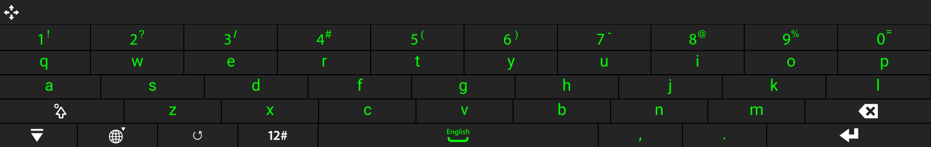
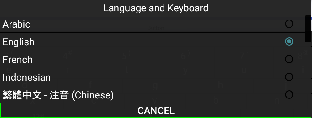
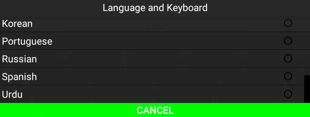
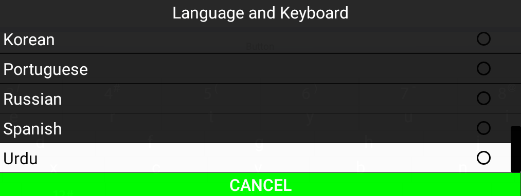
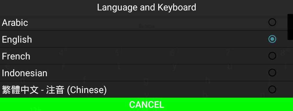
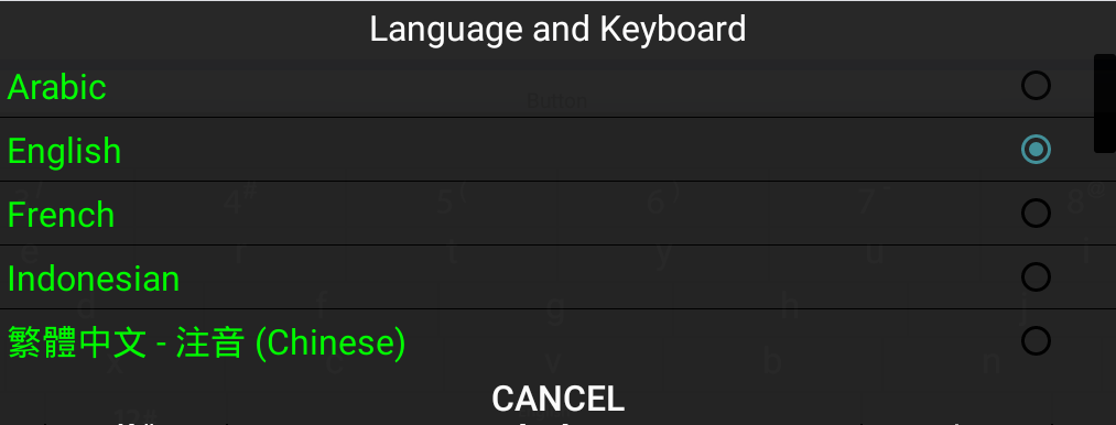
Supported Keyboard Locales
available_locales is a configuration item
containing a list of languages that display in the VKB
language selection dialog to set the keyboard language.
Local codes must be exact and case-sensitive. The list is
ordered and will display in the exact order of the
configuration. For example:
<string-array name="available_locales" ict:type="enum">
    <item>it</item>
    <item>en</item>
    <item>zh_cn</item>
    <item>vi</item>
    <item>es</item>
</string-array>
The above will display in the exact following order:
- Italian
- English
- Pinyin
- Vietnamese
- Spanish
For language codes, refer to Languages and Local Codes.
Default Configuration Values
The default keyboard settings for system, such as the NEXT Crew Terminal (CT) are as follows.
Languages and Local Codes
The following can be set in
available_locales. For more information, refer
to Supported Keyboard
Locales.
| Language Name | Local Code |
|---|---|
| Arabic | ar |
| Brazilian | pt-br |
| ChangeJie (traditional) | zh_hk |
| Dutch | nl |
| English | en |
| French | fr |
| German | de |
| Hebrew | iw |
| Hindi | hi |
| Icelandic | is |
| Indonesian | id |
| Italian | it |
| Japanese | ja |
| Korean | ko |
| Malay | ms |
| PinYin (simplified) | zh_cn |
| Punjabi | pa |
| Portuguese | pt-pt |
| Russian | ru |
| Spanish | es |
| Thai | th |
| Turkish | tr |
| Urdu | ur |
| Uzbek | uz |
| Vietnamese | vi |
| ZhuYin (traditional) | zh_tw |
| Traditional Chinese handwriting | hw_zhtr |
| Simplified Chinese handwriting | hw_zhsi |
String Values
| Name | Type | Description | Default Value |
|---|---|---|---|
app_name | String | Name of the application. | PanasonicVkbResource |
candidate_fontsize | Enum | Font size of text. Valid values:
| small |
default_language | Enum | Default language. | en |
default_system_language_support | Boolean | Enables the VKB to change its default language to match with the device language. | true |
emoji_enabled | Boolean | Enables or disables emoji input. | false |
japanese_layout | Enum | Sets the Japanese keyboard layout. Valid values:
| romaji |
key_fontsize | Enum | Font size of keys in the keyboard. Valid values:
| large |
keyboard_height_landscape | Int | Height of the keyboard in landscape mode. | 40 |
keyboard_height_portrait | Int | Height of the keyboard in portrait mode.
50 | |
pen_wait_time | Int | Length of time in milliseconds to wait before performing letter recognition. Optional and can be set if handwriting support is enabled. | 1000 |
text_toolbox_enabled | Boolean | Enables or disables text toolbox. | true |
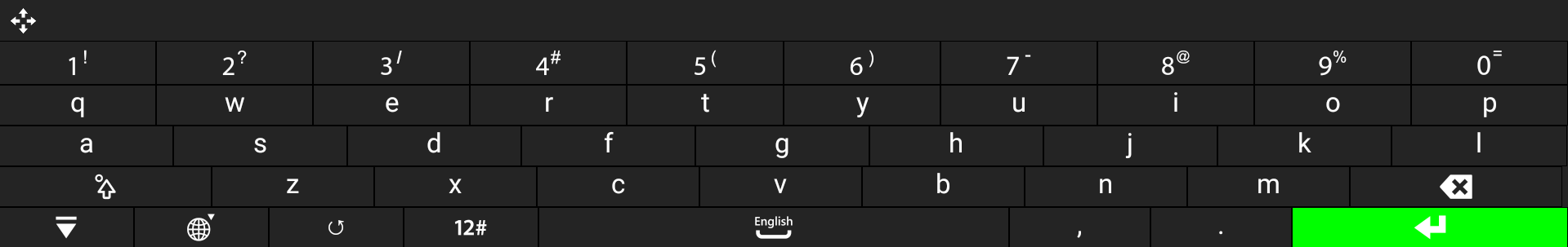
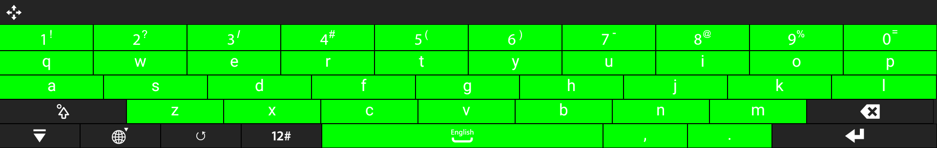
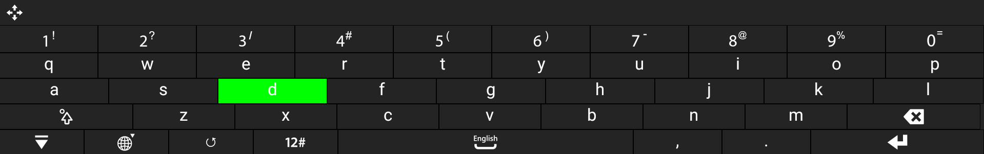
Color Values
| Name | Type | Description | Default Value |
|---|---|---|---|
candidate_first_color | Color | Text color for the first suggested word. | #28c1b8 |
candidate_mark_color | Color | Text color of the suggested symbol besides the first symbol. | #999999 |
candidate_normal_color | Color | Text color of the suggested text besides the first word. | #FFFFFF |
candidate_number_color | Color | Text color of the suggested number besides the first word. | #FF0000 |
candidate_searchtyping_color | Color | Text color of the suggested typing search text color besides the first word. | #FFFF00 |
candidate_touch_color | Color | Text color when suggested text is touched. | #46474c |
colorAccent | Color | Accent color. | #FF4081 |
colorPrimary | Color | Primary color. | #3F51B5 |
colorPrimaryDark | Color | Primary dark color. | #303F9F |
filler_box_background_color | Color | Background color for the suggested text area. | #FF242424 |
key_divider_color | Color | Color of the key divider. | #000000 |
key_function_color | Color | Background color of function keys, such as Enter and Space. | #ffB6B6B6 |
key_function_focused_color | Color | Background color of function keys when focused. | #ff28c1b8 |
key_function_pressed_color | Color | Background color of function keys when pressed. | #ff28c1b8 |
key_function_text_color | Color | Text color of function keys. | #FFFFFFFF |
key_normal_color | Color | Background color of normal keys. | #ff242424 |
key_normal_focused_color | Color | Background color of normal keys when focused. | #FF28C1B8 |
key_normal_pressed_color | Color | Background color of normal keys when pressed. | #FF28C1B8 |
key_text_color | Color | Text color of keys. | #FFFFFFFF |
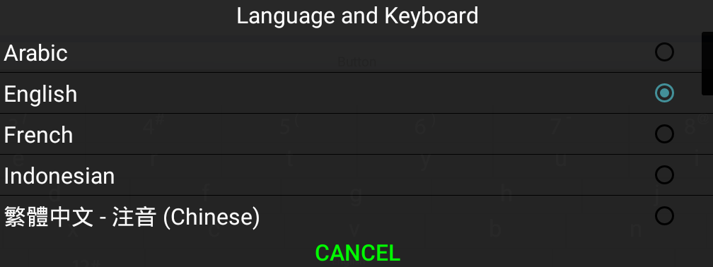
lang_dialog_cancel_btn_border_color | Color | Color of the border around the cancel button. | #5A5A5A |
lang_dialog_cancel_btn_focused_color | Color | Background color of the cancel button when focused. | #FFBF00 |
lang_dialog_cancel_btn_normal_color | Color | Background color of the cancel button. | #E5E5E5 |
lang_dialog_cancel_btn_pressed_color | Color | Background color of the cancel button when pressed. | #FFBF00 |
lang_dialog_cancel_btn_text_color | Color | Text color of the cancel button. | #000000 |
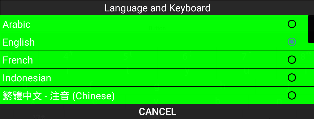
lang_dialog_list_item_background_color | Color | Color of the language entry background. | #FF242424 |
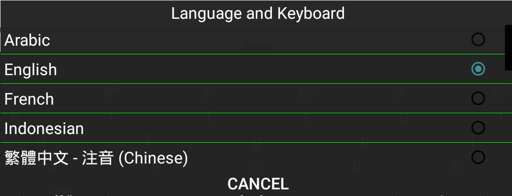
lang_dialog_list_item_divider_color | Color | Color of the language entry divider. | #000000 |
lang_dialog_list_item_focused_color | Color | Color of the language entry that has handset focus. If
not specified, this is set to the value of
key_normal_focused_color. | #FF28C1B8 |
lang_dialog_list_item_text_color | Color | Color of the language entry text. | #FFFFFF |
lang_dialog_list_title_background_color | Color | Background color of the list title. | #5A5A5A |
lang_dialog_list_title_text_color | Color | Text color of the list title. | #FFFFFF |
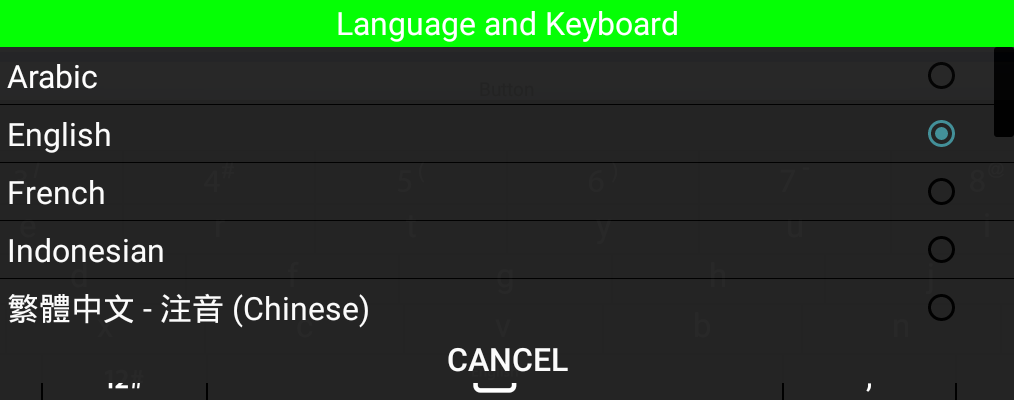
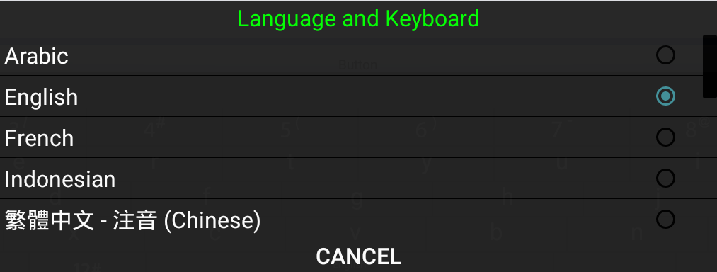
lang_dialog_title_background_color | Color | Background color of the language selection title. | #0000ff |
lang_dialog_title_text_color | Color | Text color of the language selection title. | #ff0000 |
Examples of Configured Color Values
key_function_pressed_color
key_function_text_color
key_normal_color
key_normal_pressed_color
key_text_color
lang_dialog_cancel_btn_border_color
lang_dialog_cancel_btn_focused_color
lang_dialog_cancel_btn_normal_color
lang_dialog_cancel_btn_pressed_color
lang_dialog_cancel_btn_text_color
lang_dialog_list_item_background_color
lang_dialog_list_item_divider_color
lang_dialog_list_item_text_color
lang_dialog_list_title_background_color
lang_dialog_title_text_color
Customize the VKB
Change Configurations and Colors
To customize the VKB, edit the existing VKB
android_vkb_resources theme in Config Tool
2.0:
In the left navigation menu, select Themes.
Select android_vkb_resources from the list of themes.
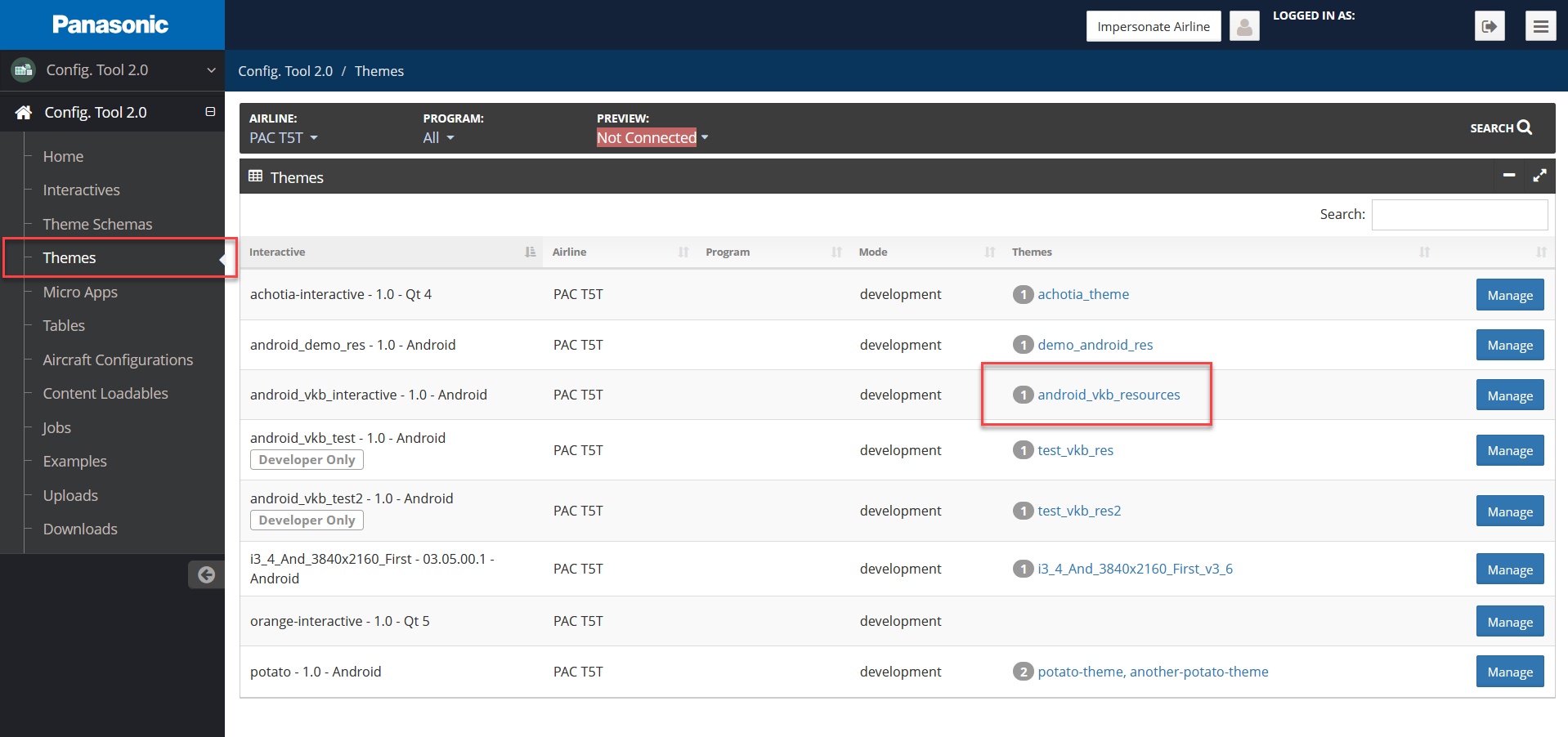
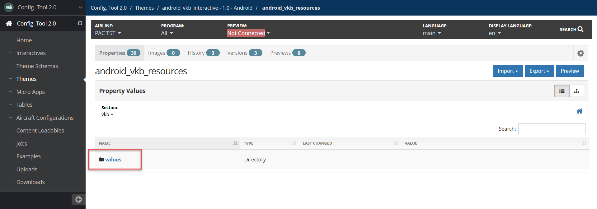
Config Tool Themes page with android_vkb_resources theme highlighted On the Properties page, select the values directory.
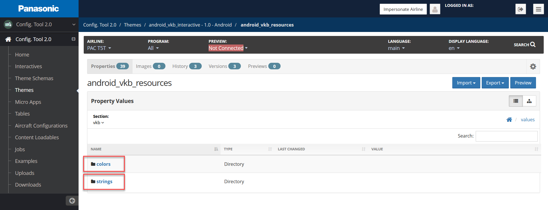
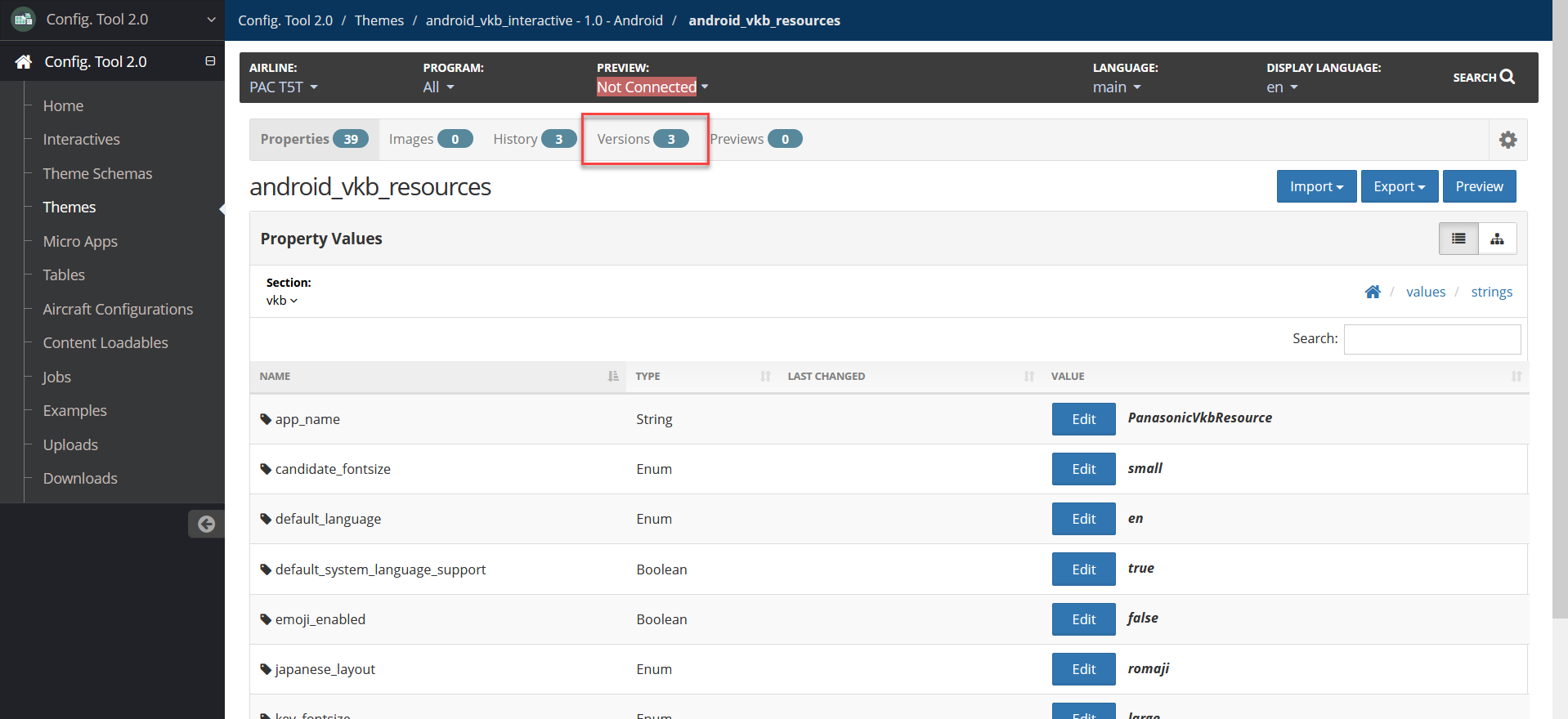
Config Tool Theme Properties with values directory highlighted Select the colors or strings directory to view and modify the configurable options in the theme.
Config Tool Theme Properties with colors and strings directory highlighted For configurable options, refer to Default Configuration Values.
Change Default Language
To change the default language:
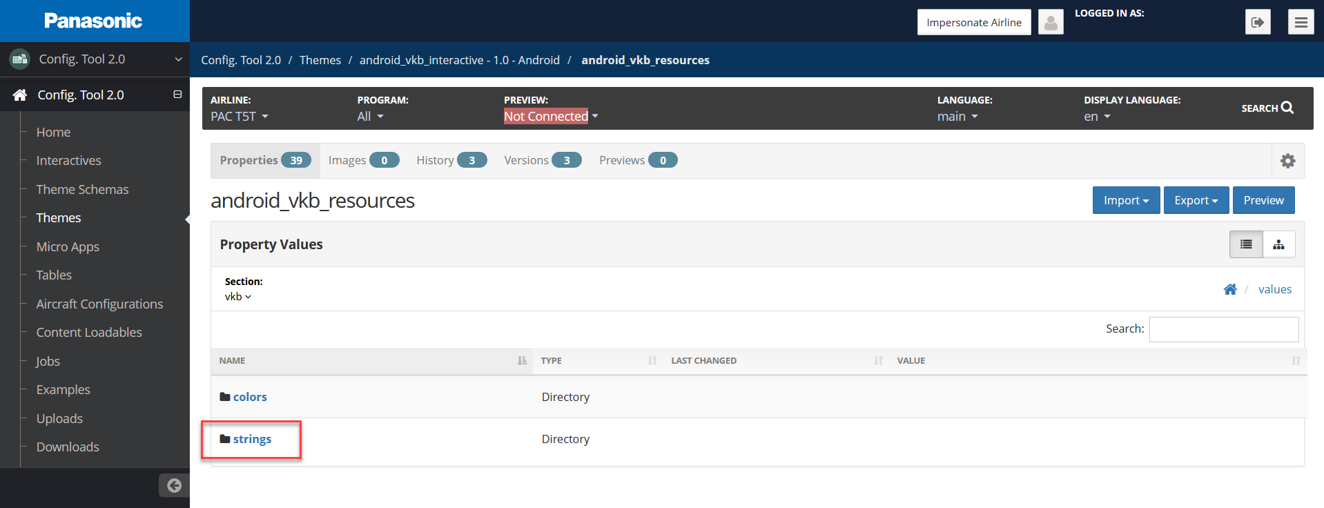
Select the strings directory.
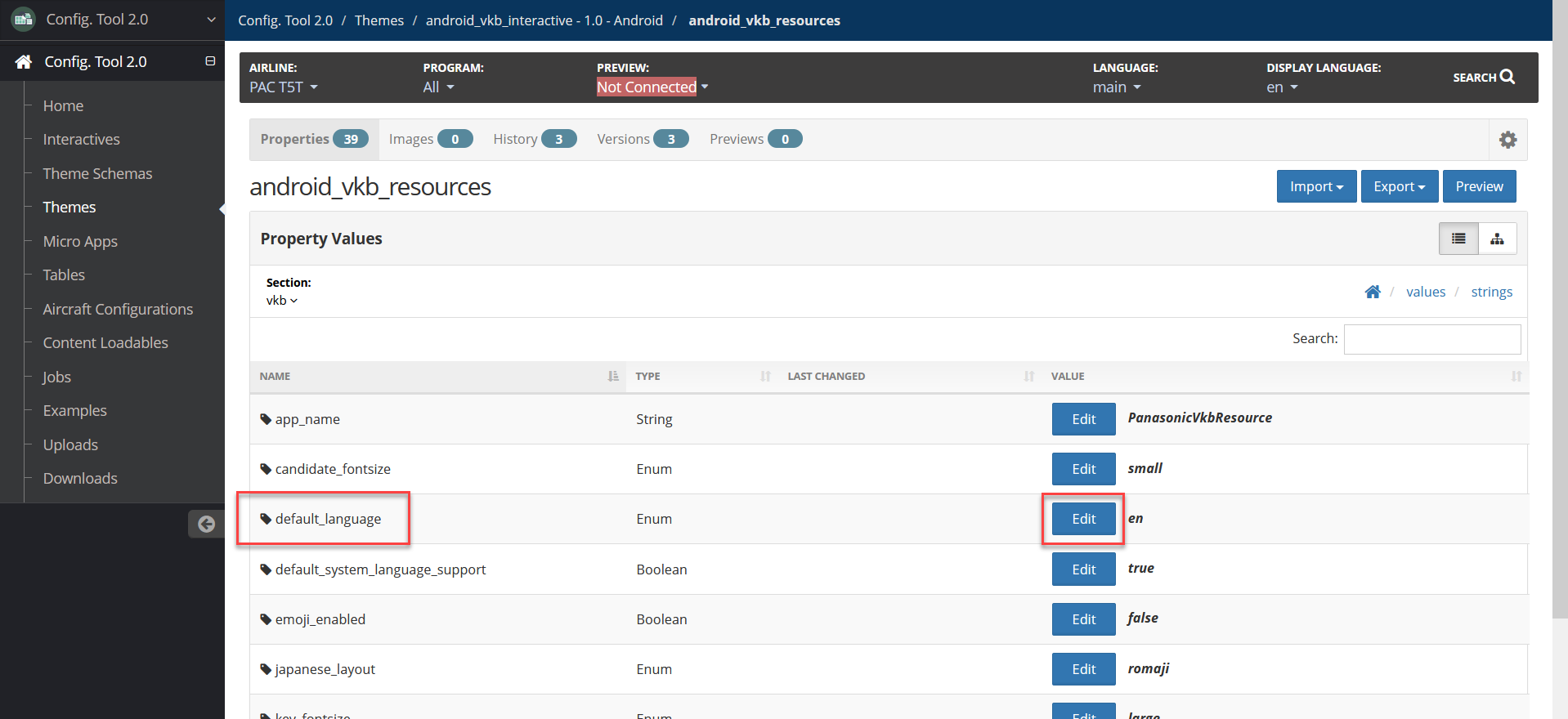
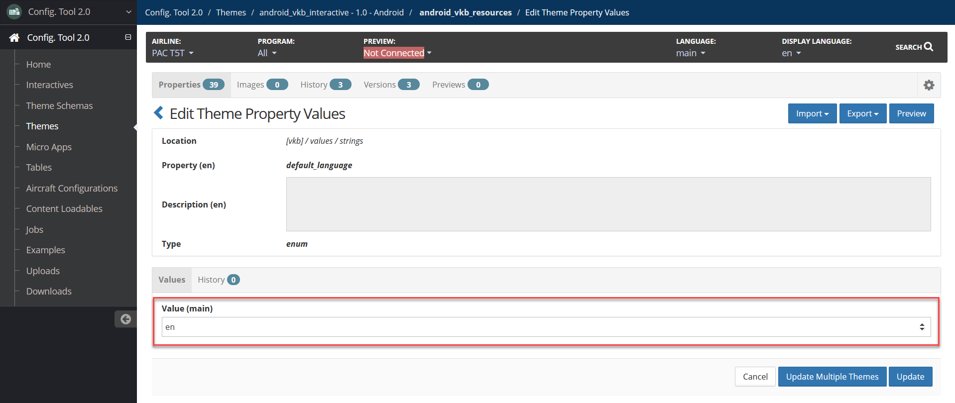
Config Tool Theme Properties with strings directory highlighted Locate the default_language property, then select Edit.
Config Tool Theme Properties with default_language property value highlighted Modify the Value (main) field by selecting a different language from the dropdown, then select Update.
For language local codes, refer to Languages and Local Codes.
Config Tool Edit Theme Property Values page with value highlighted Select Update.
Create a Theme Version
To create a version:
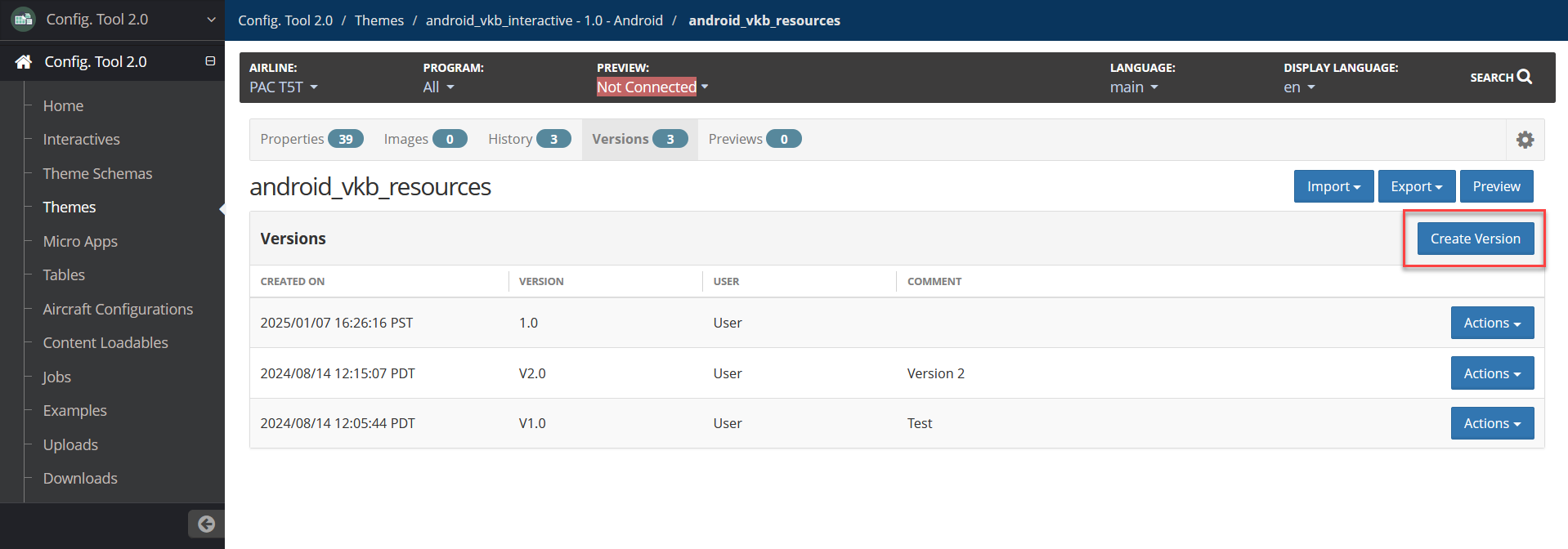
In the theme, select the Versions tab.
Config Tool Theme Properties page with Versions tab highlighted Select Create Version.
Config Tool Theme Versions page with Create Version button highlighted Add a Version and an optional Comment.
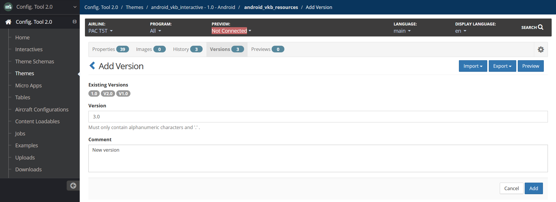
Config Tool Add Version page Select Add.
Create Content Loadable
To create a content loadable:
In the left navigation, select Content Loadables.
Select Android VKB.
Select Prepare Loadable, then select Create to confirm initializing the content loadable.
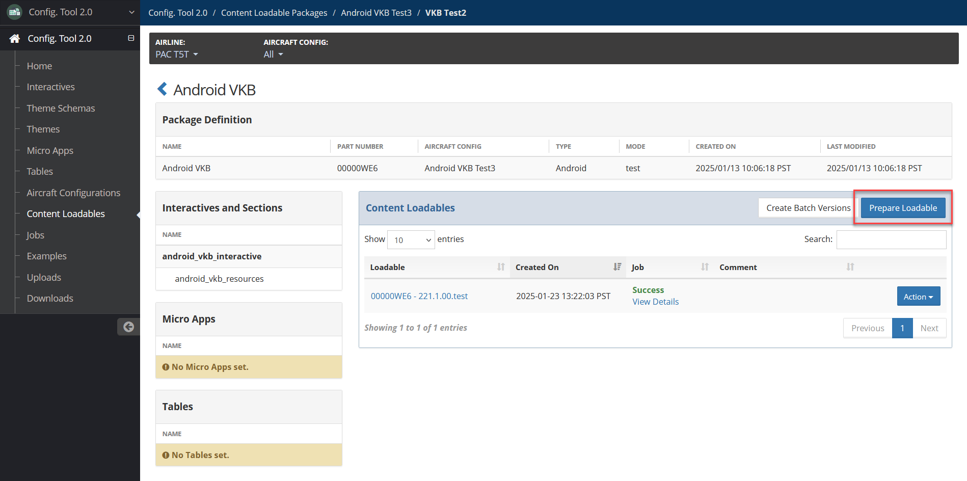
Config Tool Content Loadable page with Prepare Loadable button highlighted The most recent Theme version displays by default. Select Edit Comment to add a comment if needed.
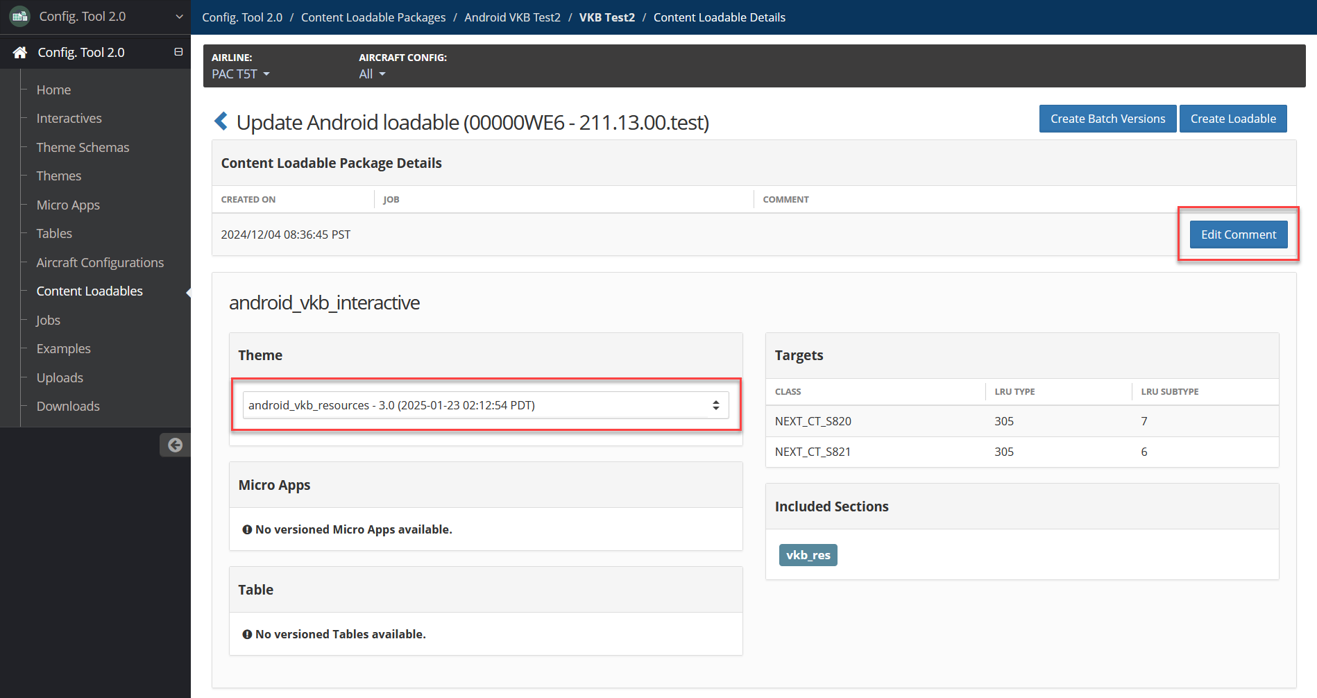
Config Tool Content Loadable page with Edit Comment button and Theme highlighted Select Create Loadable.
Locate the loadable on the Jobs page.
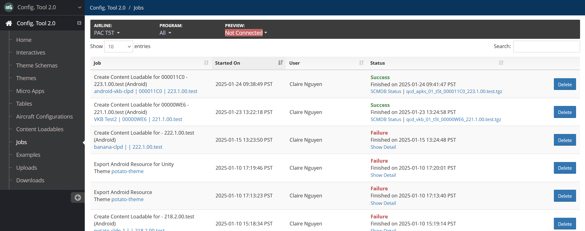
Config Tool Jobs page